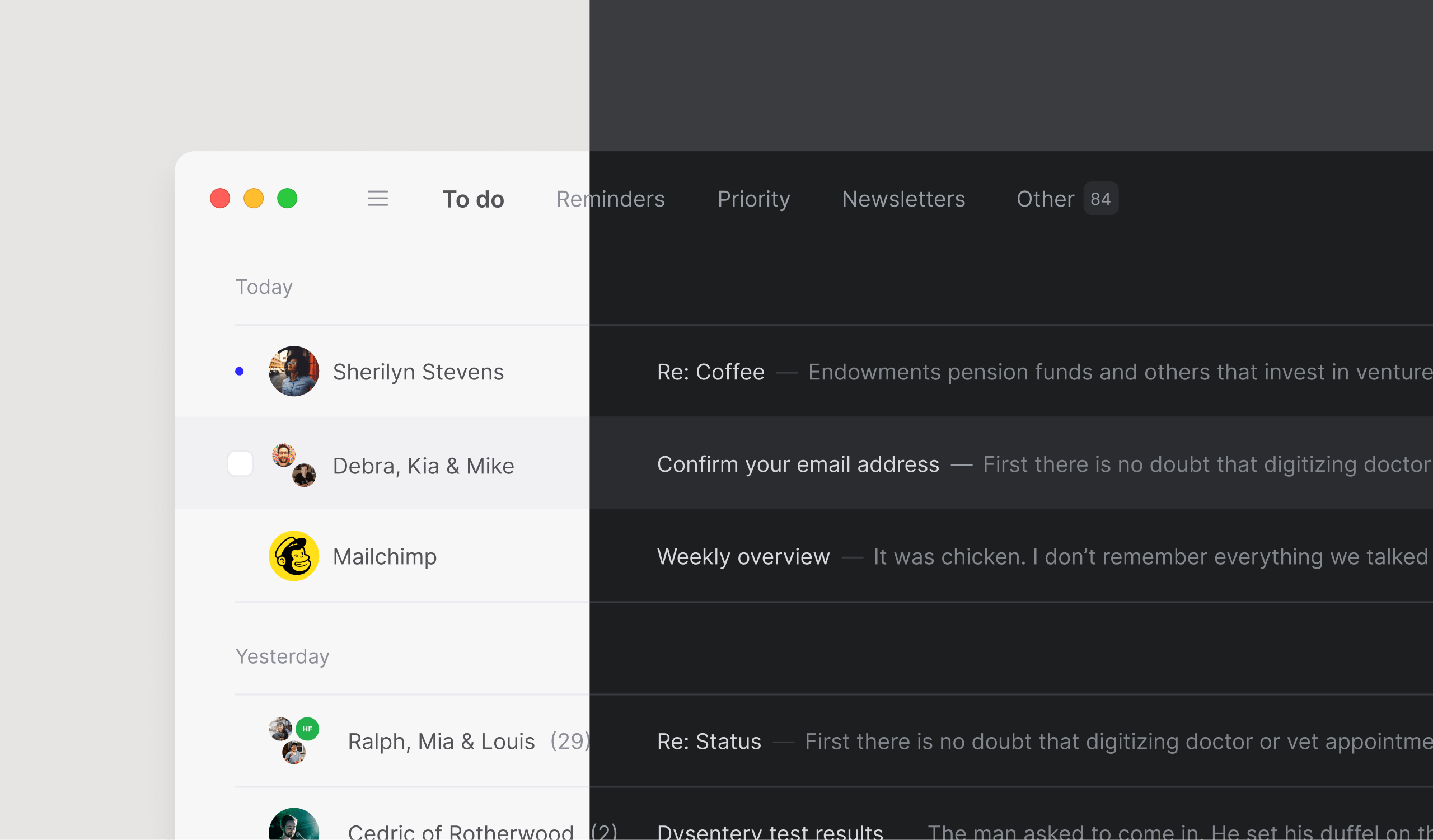
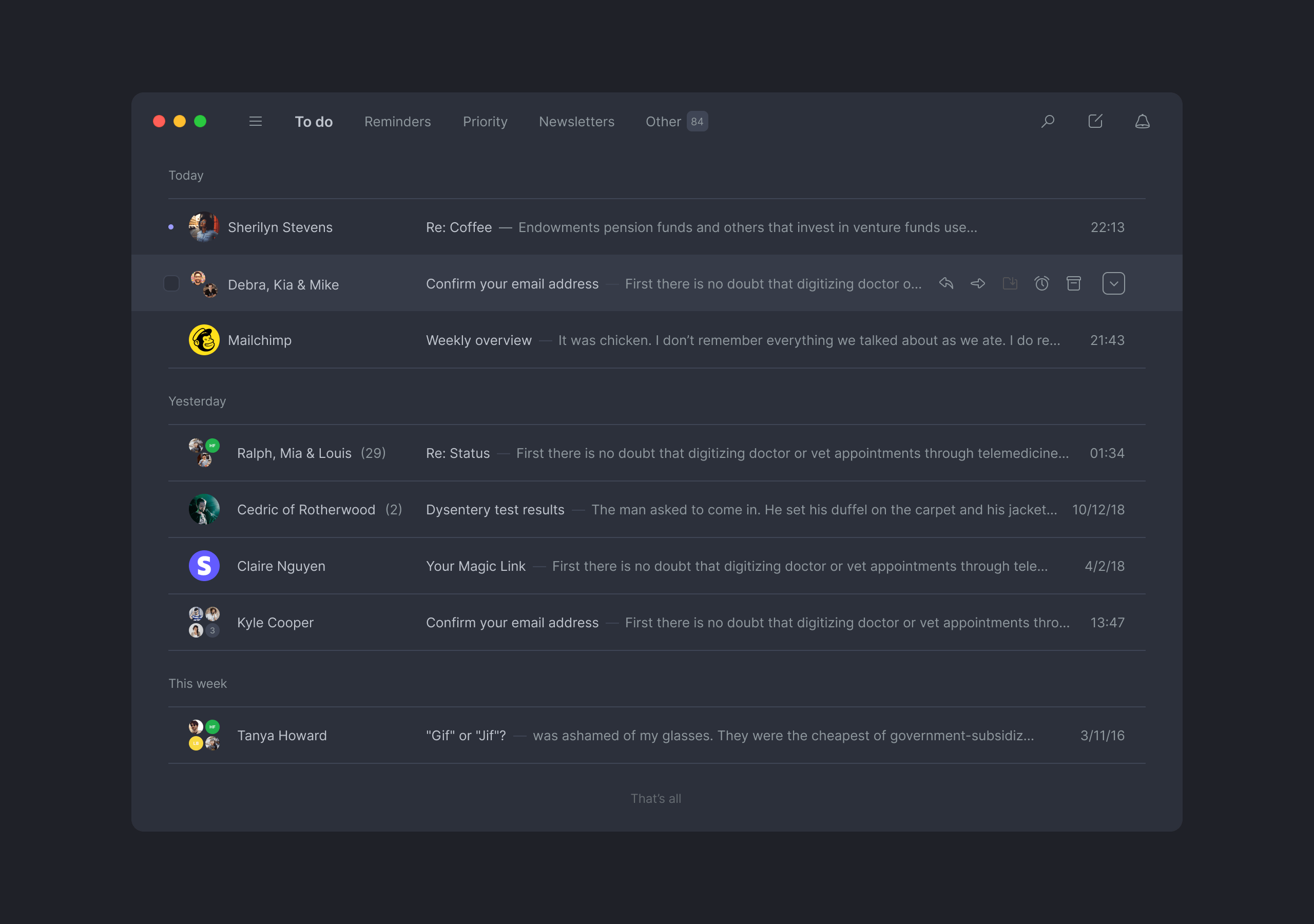
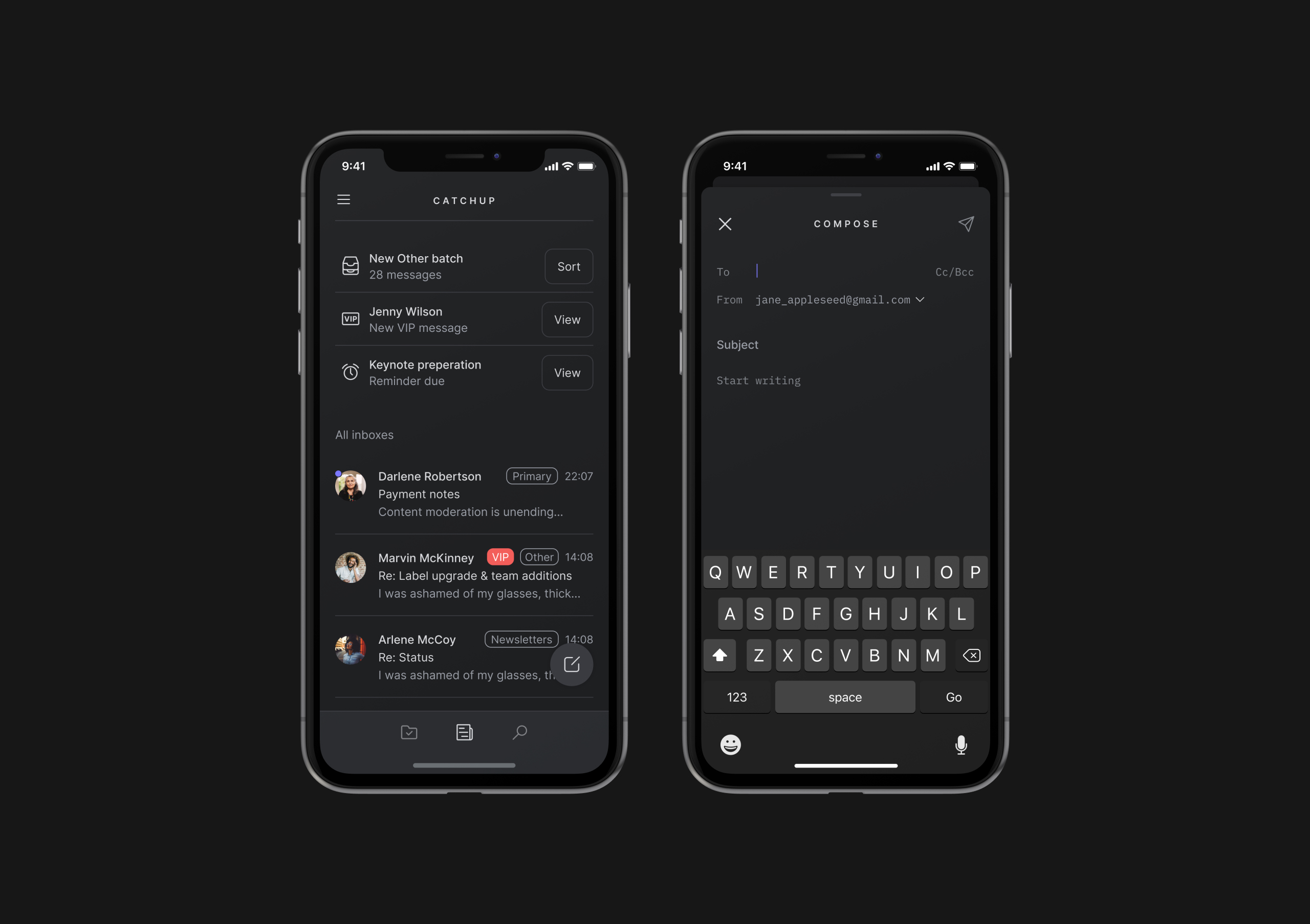
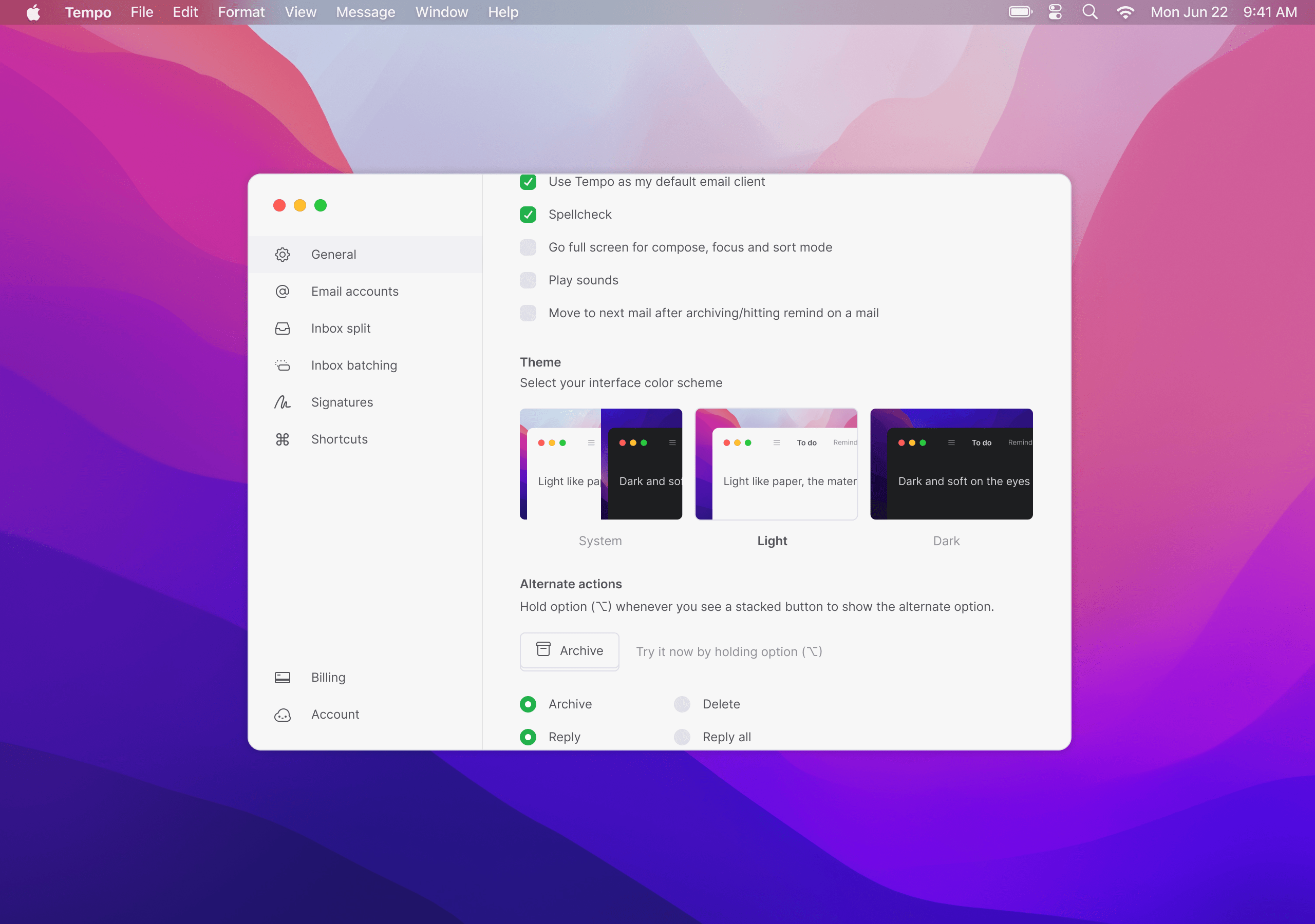
Tempo night mode
Designing a dark-mode feature
👨🏼🎨
I highlighted this project because it's very UI focused and had a lot of fun working on it.
Problem
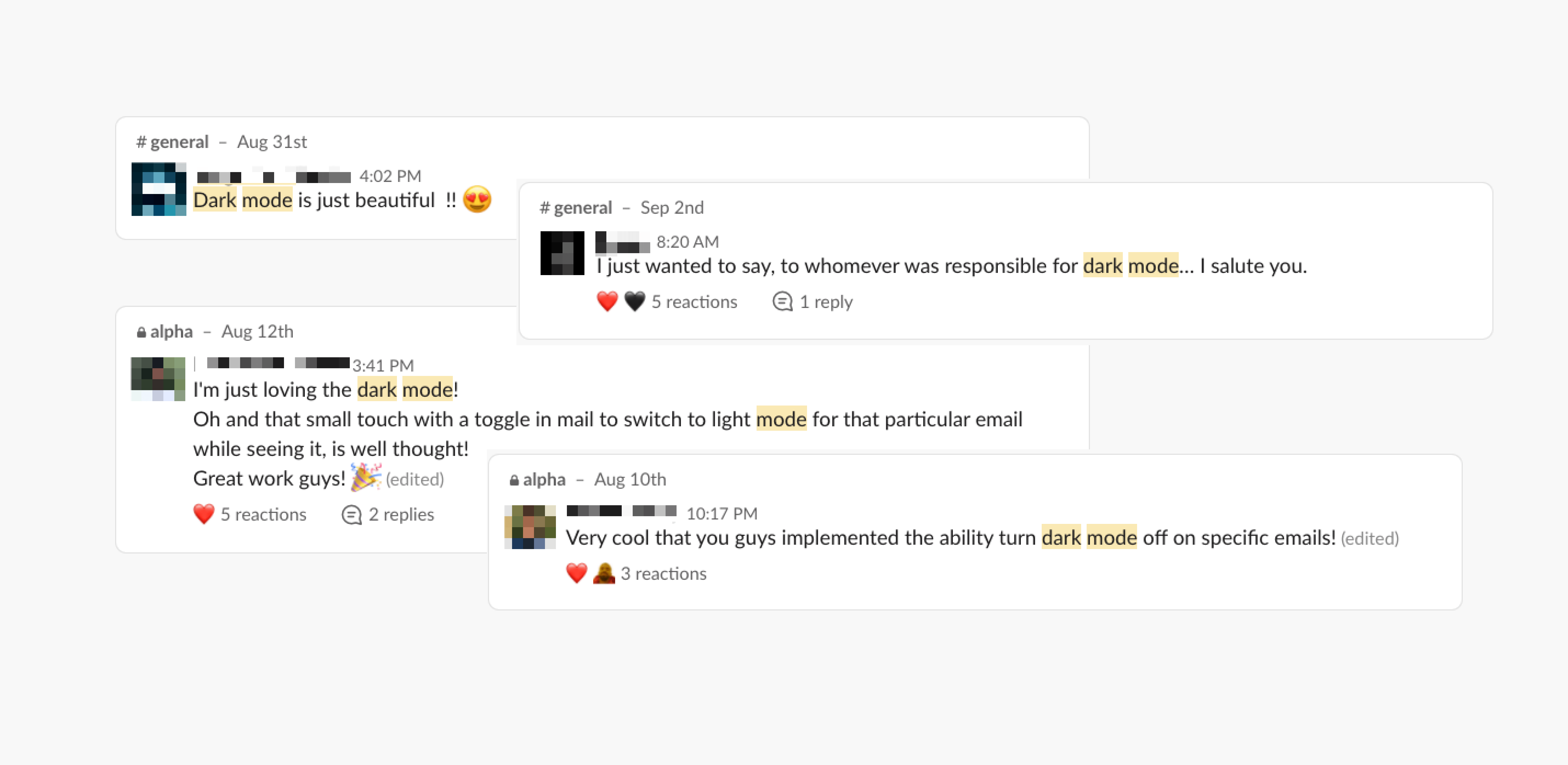
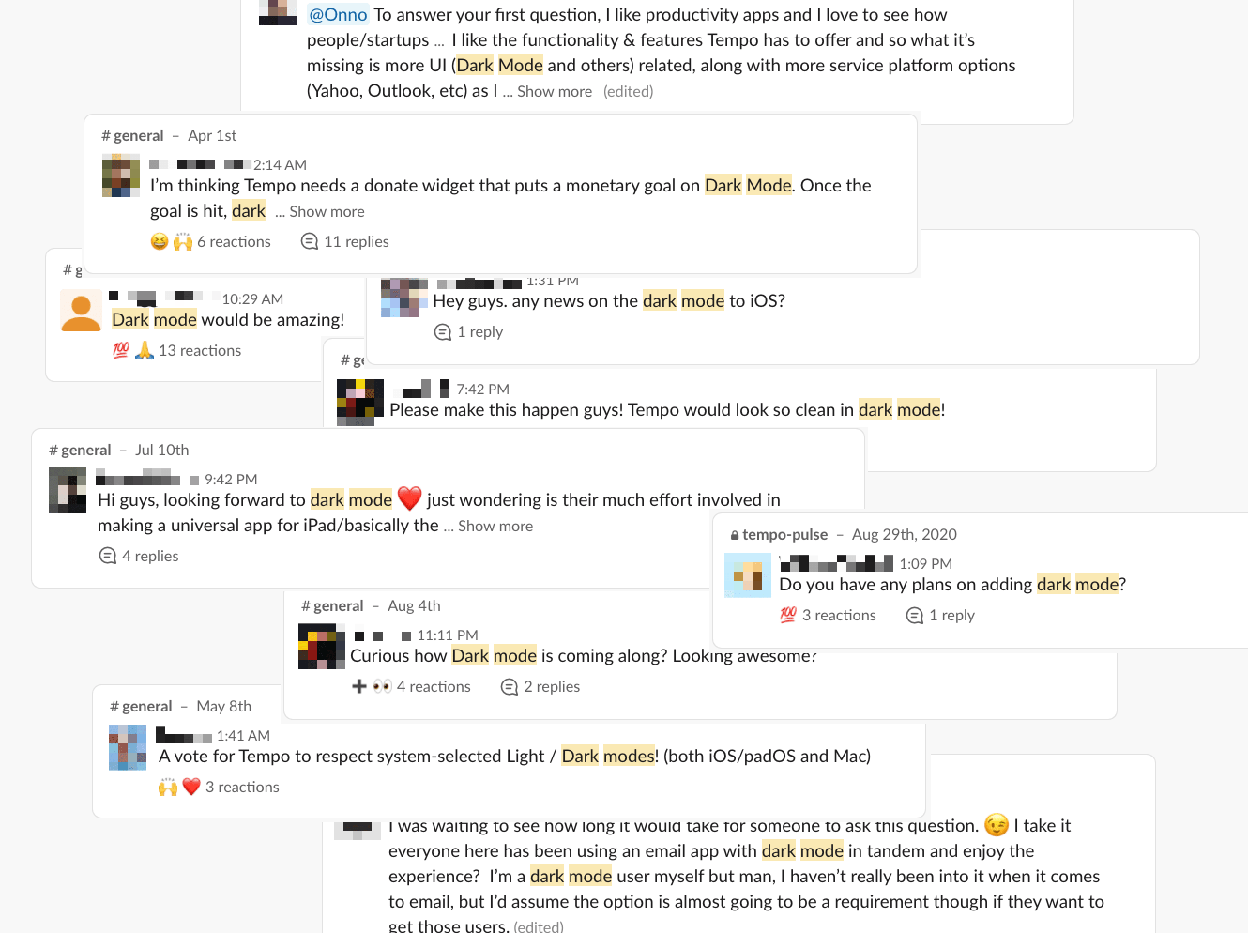
Lack of dark-mode support makes Tempo stand out on your desktop. As it has become a common expectation for any modern (paid) productivity app, Tempo's userbase has become a vocal proponent of this feature.
Challenge
Defining a solid color scheme, with lack of documentation. What do we want a dark Tempo to look like and why?
Process
Not being a dark-mode user nor having designed anything for dark mode, I got a lay of the land first.
- 💻 OS compatibility rate → an overwhelming 96% of users being on the latest version of macOS (Big Sur) and 90% on the latest version iOS (14). To run dark mode, the operating system required Mojave and up for Mac and iOS 13 and up for iPhone. Check.
- 📣 User requests → dark-mode was one of those typical requests that kept resurfacing on our community page on a weekly basis. Double-check.
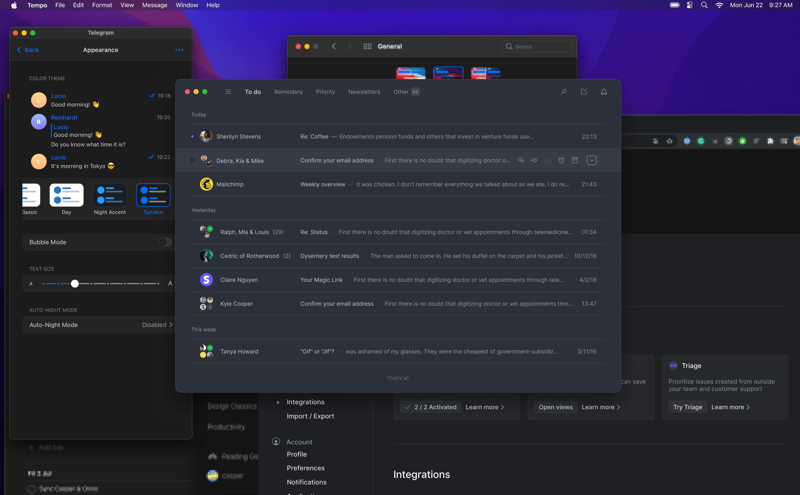
- 📚 Documentation → while there was a dark-mode section in Apple's HIG, the guidelines on dark mode are uncharacteristically loose in their definition. And this shows! Many apps come up with their own dark-mode themes, so when opening different windows at once usually results in a patchwork. We dubbed this the patchwork problem.
To make up for the lack of guidelines on Apple's end. We came up with a set of guidelines on our own. These would be used to score any future dark-mode themes.
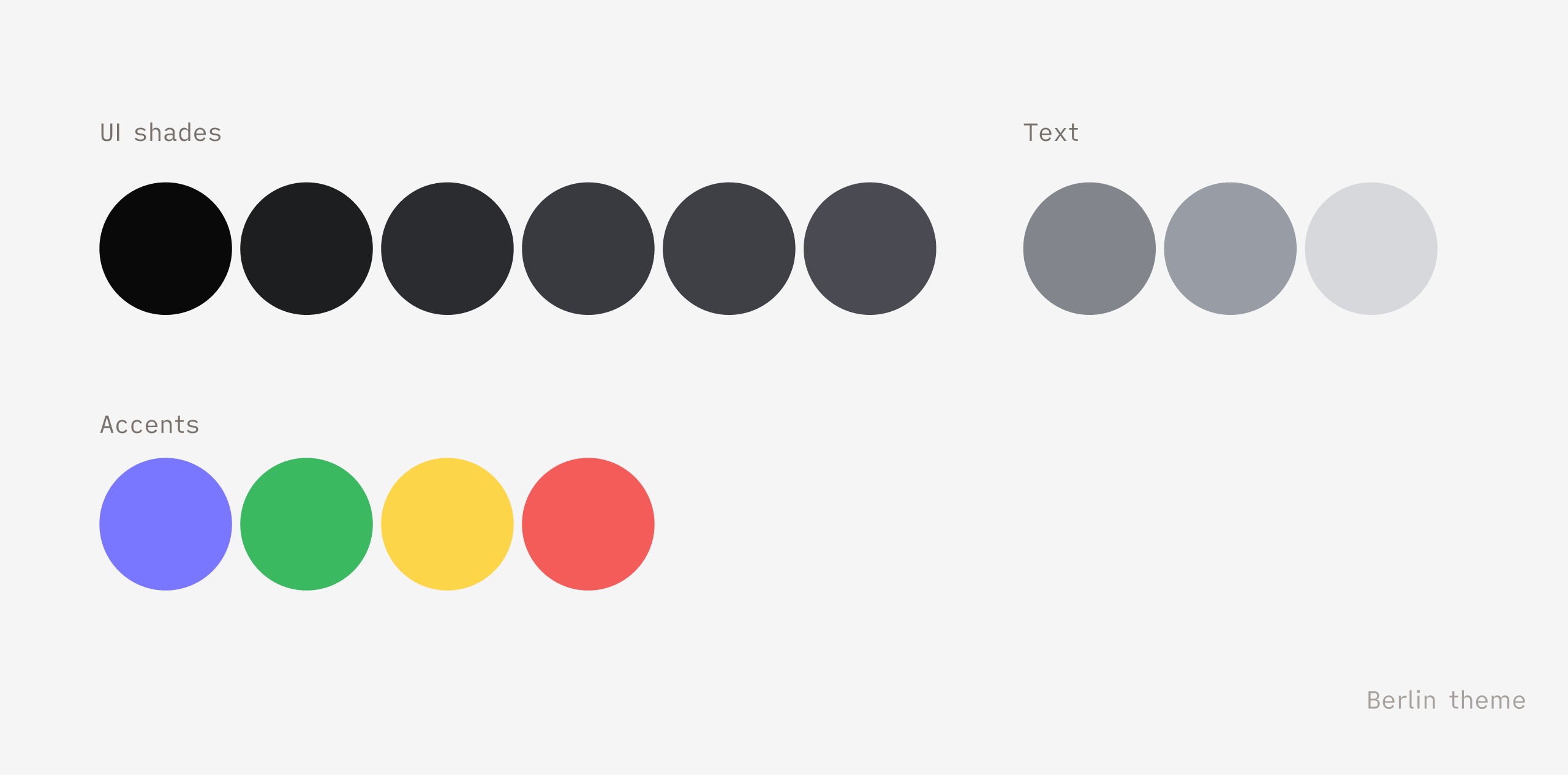
- The dark theme should be accessible for the visually impaired. Initiatives like these are a great time to focus on the accessibility of your color scheme to avert future accessibility issues from the get-go. We made sure any theme scored AAA on primary information text styles and AA on any secondary info (measured through Able, an awesome accessibility plugin for Figma)
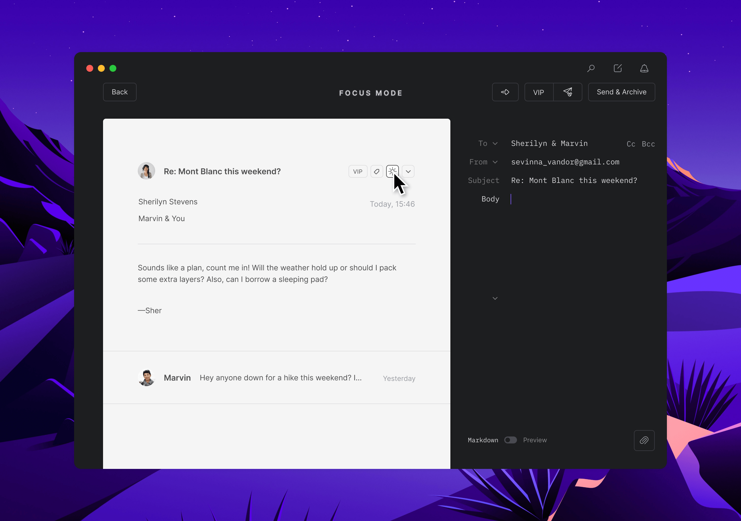
- The dark theme should pass the window test™. Productivity tools shouldn't require your constant attention, especially in Tempo's case. Following the ideals of mindful tech, we didn't want it to stand out. Visually, we also didn't want Tempo to contribute to the patchwork problem, and so we devised the window test, where we're quickly able to compare and assess how different dark-mode themes blend in with the other apps.
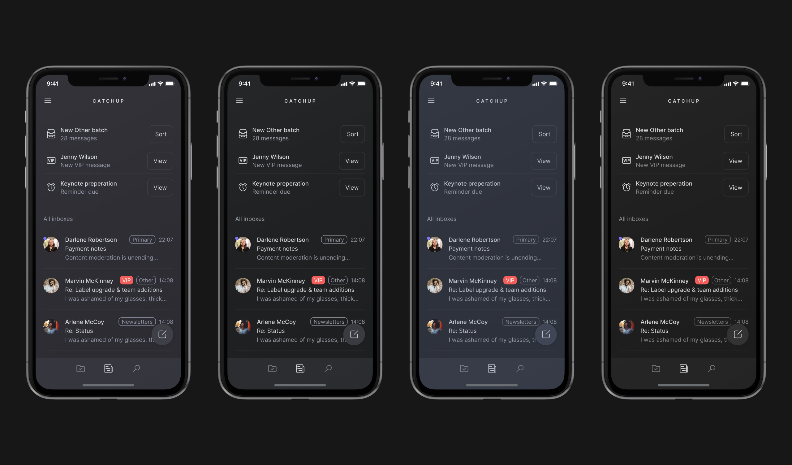
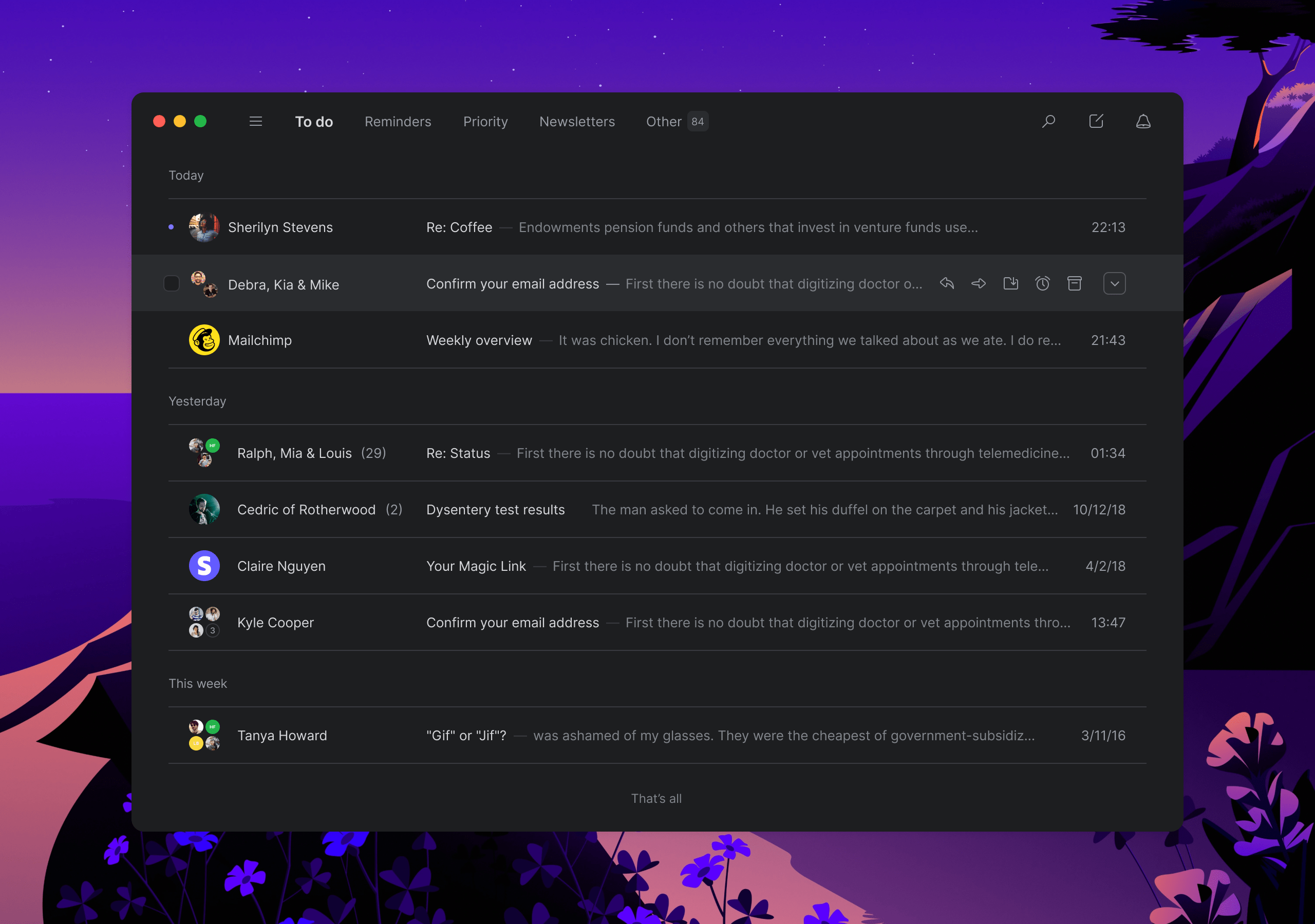
- The theme should be product-agnostic. Meaning it should work for Mac, the new MVP on iOS, the marketing website etc.
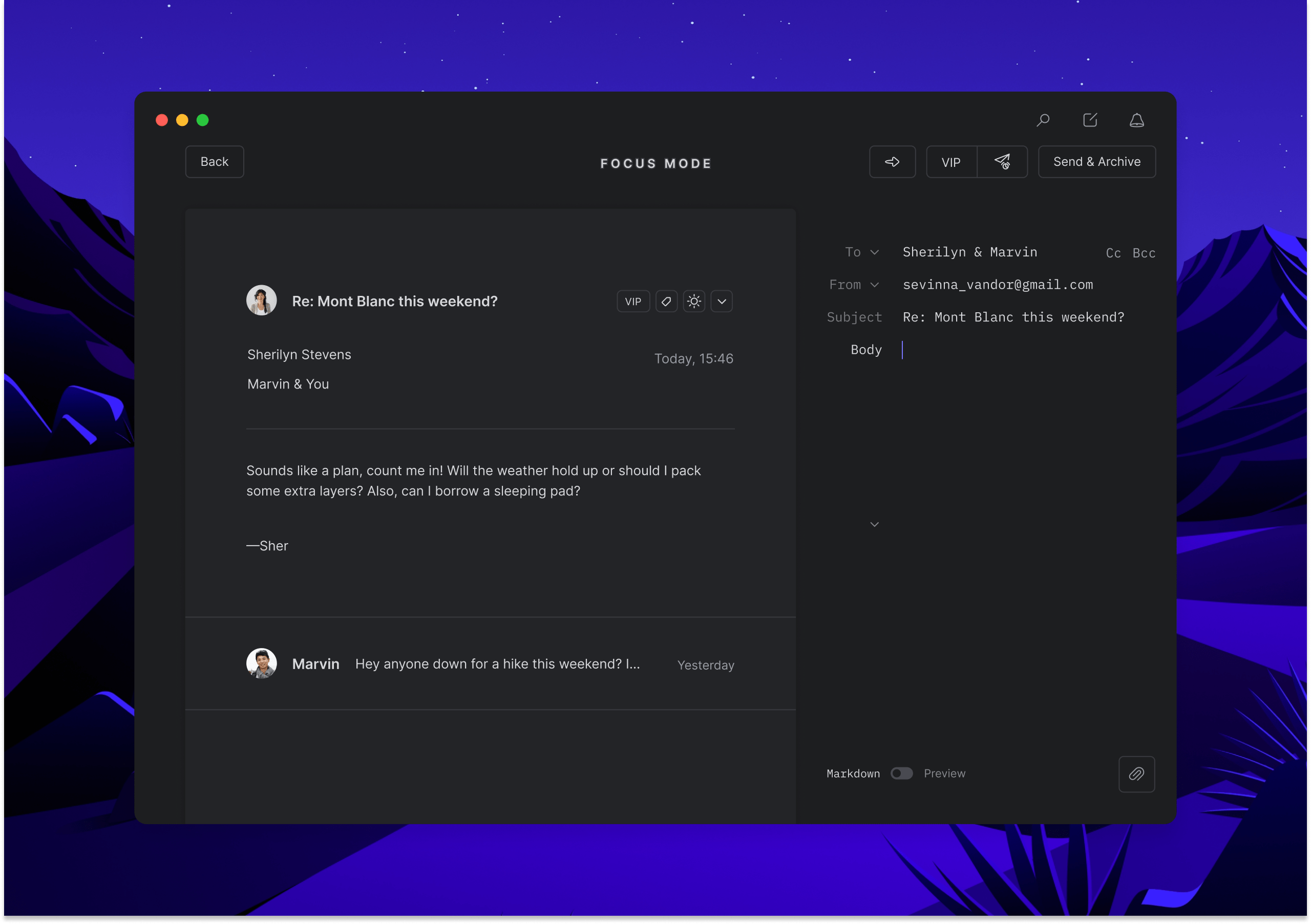
Design
Going beyond
Defining a good looking color scheme is a pretty basic expectation for a dark-mode. Because the progress on the night mode progressed faster than anticipated, the team continued adding some extra details under the hood.
🌙 Nightly soundscape
Tempo uses two sounds: one for getting to inbox zero and one for finishing a sort. These soundscapes feel airy and light.
We wanted to make these sounds match the night, so we lowered the pitch and added extra reverb to give a more moody atmosphere. Fun fact, we even made a small Spotify playlist filled with songs we related to the night.
🕶️ Email conversion
Let's face it, emails are notorious territory for developers to build for due to their complex and outdated code structures. That said, the developer Leo has done some great work on this aspect. His script will check for any pre-defined dark-mode styles in the email. If it can't find any, it will take the body of the email and invert the colors on the fly.
Reflection
Here are a few take-aways when looking back at this project:
- Be conservative with accepting new features from the user base right away, the ones that will make it through usually stand out and get repeated many times.
- (Wearing PM hat) don't be afraid to overshoot in scope, but cover your bases first.
- Good ideas can come from anywhere: changing the soundscapes were an idea from a backend developer.