Tempo for iOS
Designing an MVP from scratch
🖊
I've highlighted this project because it's the biggest and broadest case I was able to work on during my time at Tempo. I hope it conveys some of my way of thinking and decision making when building out a product.
The problem
Tempo had been around for a year or two on desktop. Still, its users had to rely on third-party email apps when on mobile.
Outcome
Shipping an iOS app from scratch to Tempo's existing user base in 3–4 months time in a team of six.
Defining the case
Being a two-year-old startup, Tempo's objective was to grow. The company had just introduced their business model around the time I joined the team back in January 2021. New trials were starting, subscribers were rising, and we wanted to keep the pace up. The big theme for this year would be the introduction of a mobile app, and I was asked to work on it.
Being new at the company, I understood the reasoning for adding a mobile app from the business perspective: the more value you bring into your paid offering, the easier it is for new users to convert into paid subscribers. No rocket science there. Still with me? Good.
What I wanted to find out, however, was whether a new mobile app was a need from the users' perspective too. To validate this, we decided it would be best to just ask them.
The objective
I think it takes time to get a good product out the door. Looking back at the trajectory from WeTransfer's Collect app, I assumed that we'd require at least 1–2 years of development before we'd get mobile in a good place, and openly launch it.
We were eager to start, and decided on a lean approach: this initiative's objective would be to define and build a minimum viable product; something we could ship early to our existing user base and learn from. In the long term, the MVP aimed to serve as a structure to build future improvements on.
Defining the direction of the MVP
Holding us back was our team's size: Tempo consisted of just six people, of which four were actively developing out the product. We also had the responsibility to maintain the desktop app. I'm used to design with scarcity in development strength in mind, and so it became my goal to come up with an app that was light and straightforward enough to be developed in a quarter.
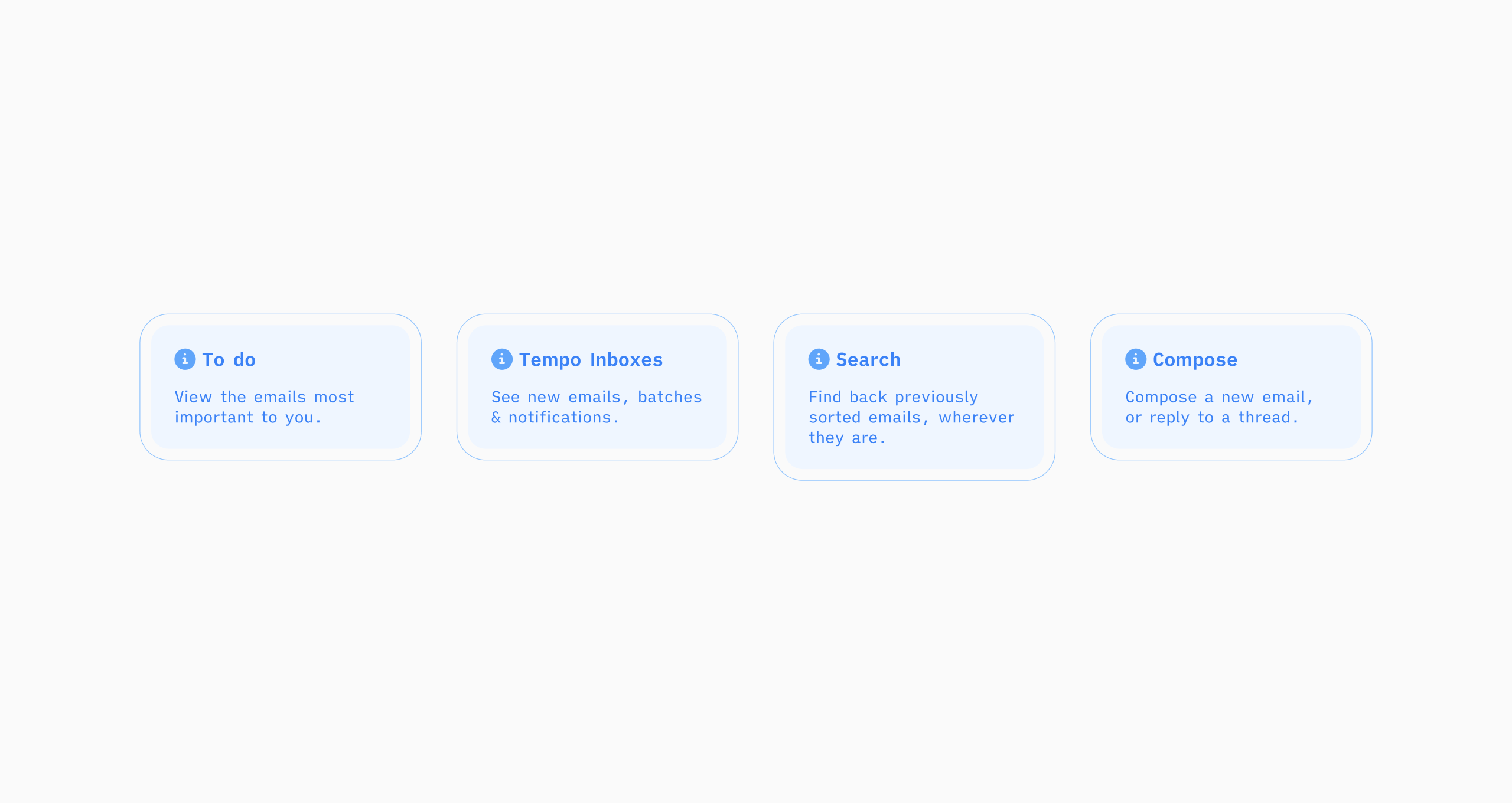
To start off, I defined 3 promises to rally the MVP around. These promises were partly defined through
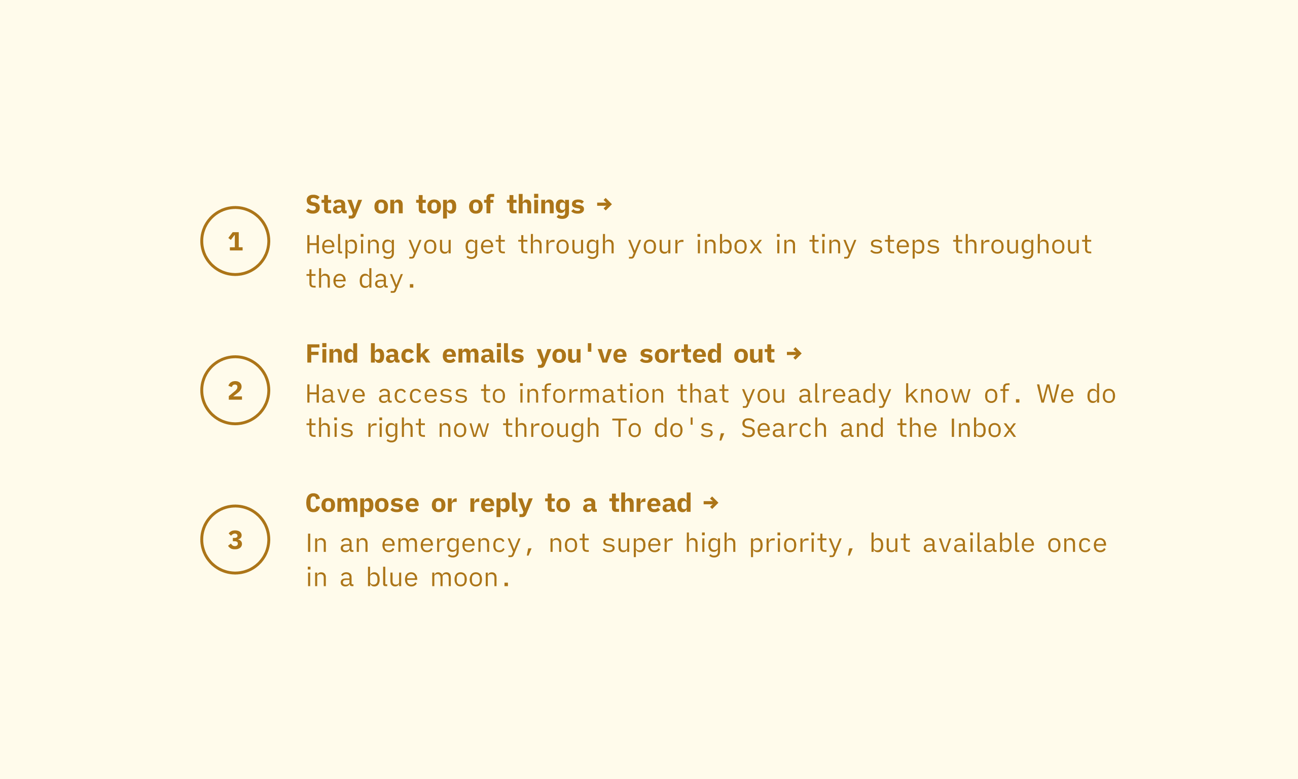
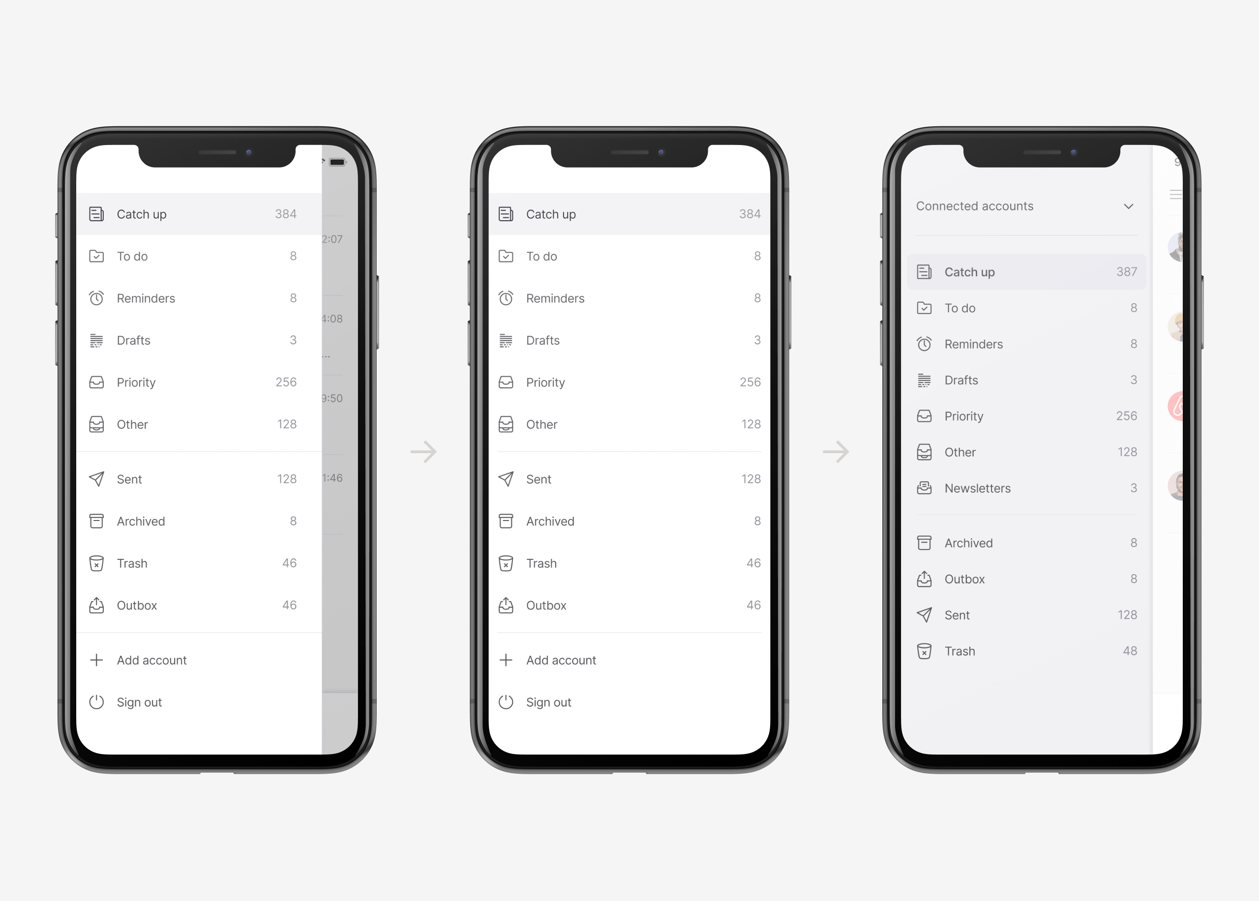
These promises were goals that can be achieved in many forms. With the promises laid out, I set out to mock up a few directions on what I thought a hypothetical MVP could be like. Here are a few concepts I discussed with the team.
After a lot of discussions, the team reached a consensus decided to move forward with the third concept. The deciding argument here was again scope-related. Concept 1-2 relied on some systems that had to be built from the ground up. By not deviating too much from the desktop app, we were able to leverage existing backend structures more easily.
👨🏼🎨
When asked for my preferred concept, I suggested number two. I liked the idea of a mobile companion trying to focus on something different than on desktop. The idea of a sorting app also seemed interesting from a design point of view, as there are not a lot of email apps that do this. Eventually, I agreed to go forward with concept three because—while it would start more generic—I could see how ideas from the other concepts could potentially work within the structure as well.
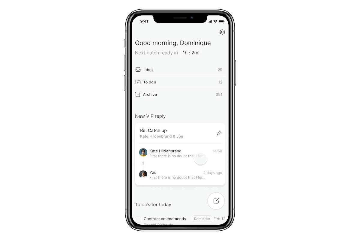
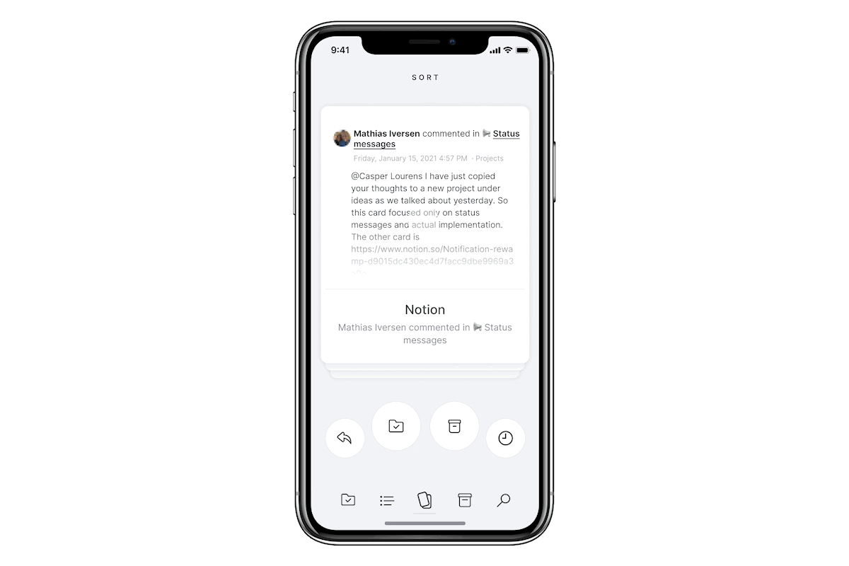
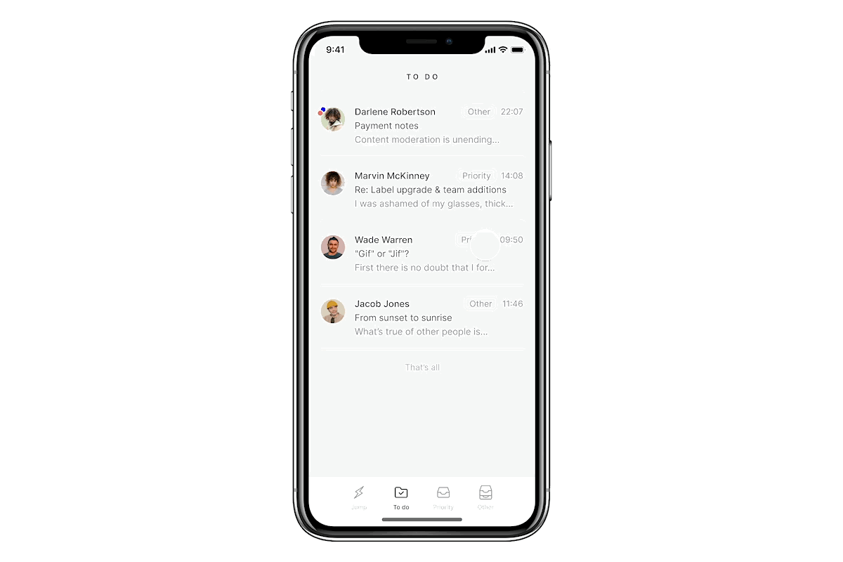
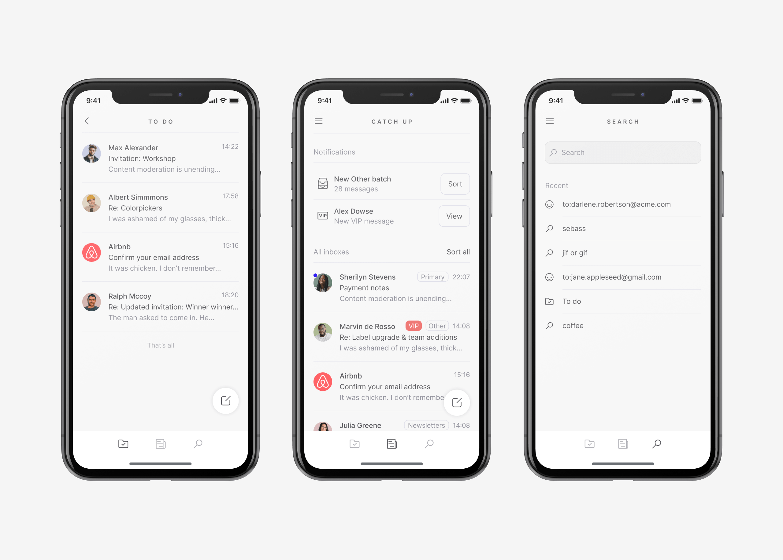
Building the MVP
With the direction for the app decided on, I moved on to defining the core priorities for the third concept.
📱
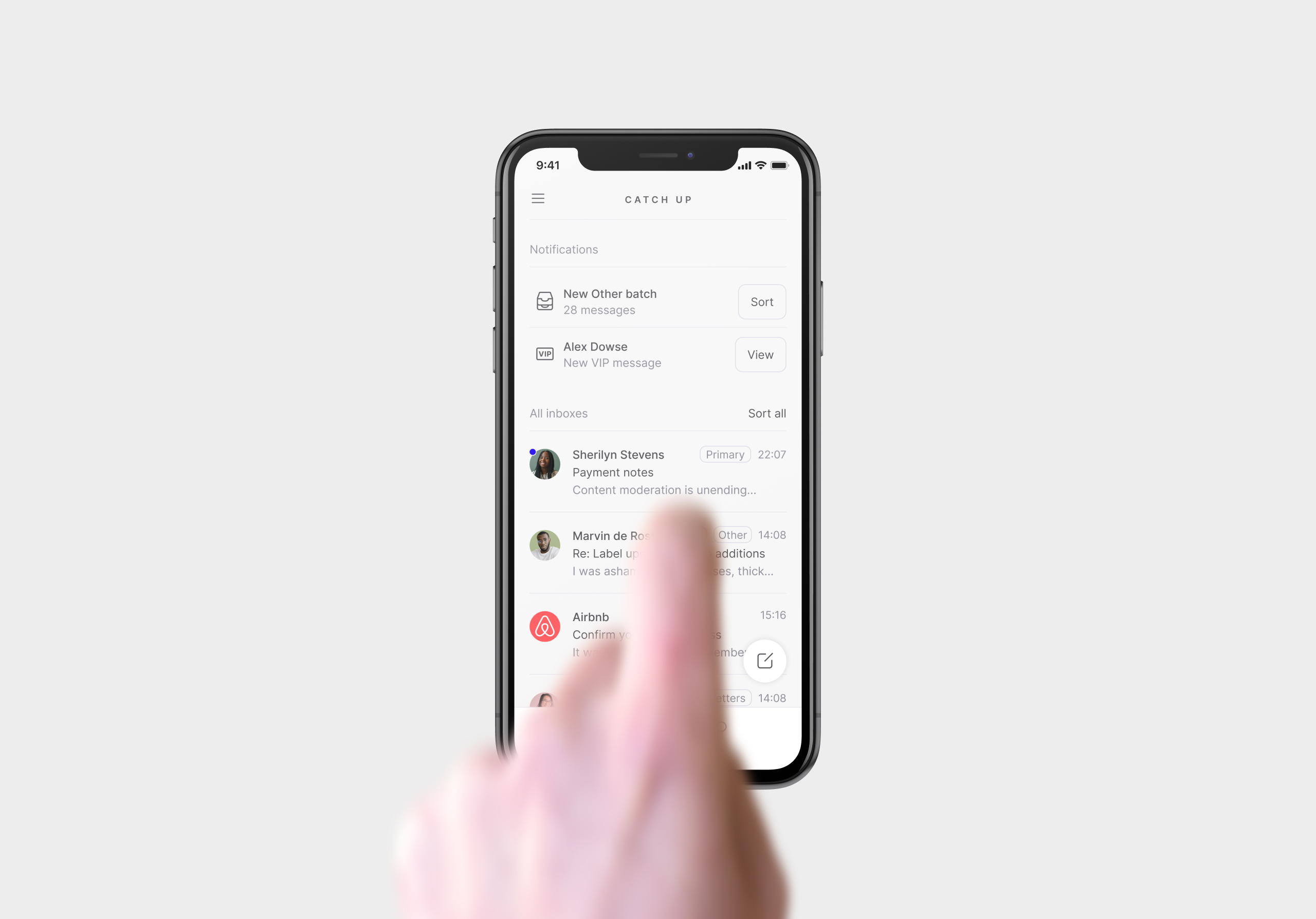
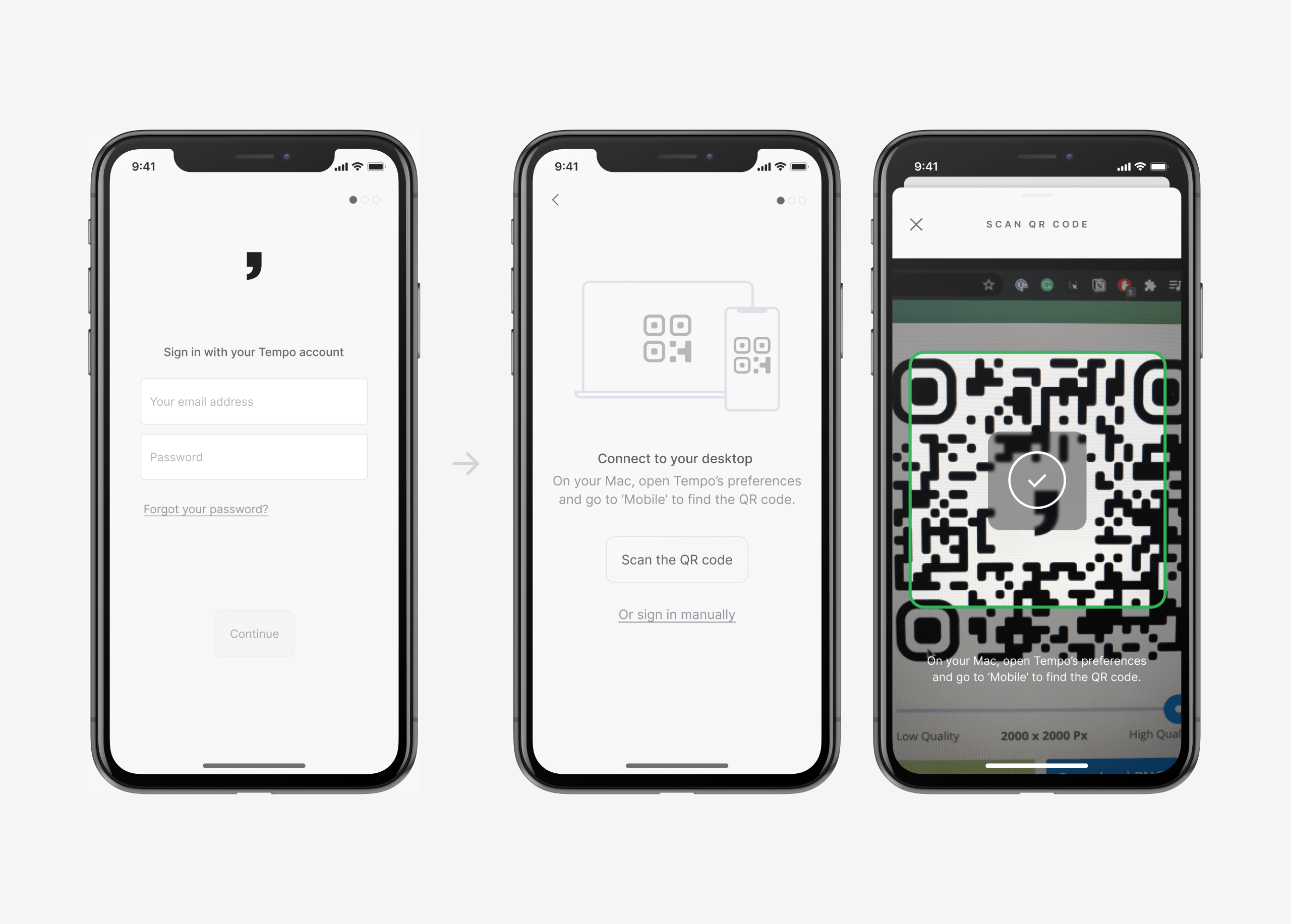
Just want to see the product? You can find a small walkthrough of the app over on Loom.
Along the way, I learned that the developers were very proficient in getting things out of the door quickly and iteratively. It bred a lot of trust: if we weren't able to fully address a problem the first time, we could count on each other to fix it later. This trust manifested in our way of work too, where we assessed potential features and improvements on a weekly basis instead of me committing to doing a lot of design work up front.
In these prioritisation calls, my decision tree would roughly look like this:
- The goal is to ship something to Tempo's internal user base by the end of the quarter.
- As long as that something delivers on the three promises, the MVP would be viable.
- Delivering on a promise doesn't require full feature parity (compared to desktop). As long as you're able to take it out in daily use, it will be enough for now.
- Anything built outside of the promises is considered an extra.
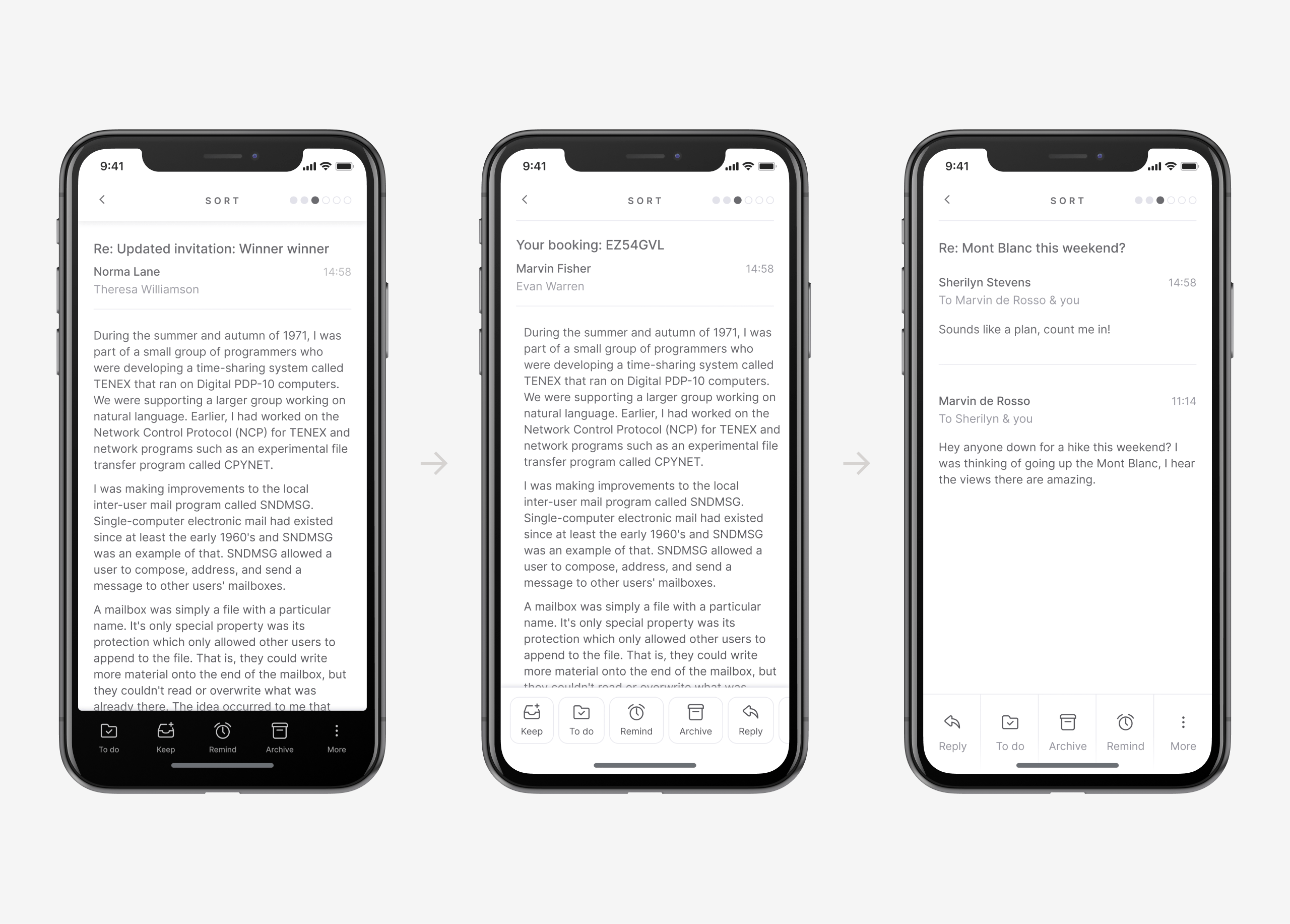
After the first versions of the key screens were added, everyone in the team voluntarily removed their mail apps from their phones and started using the MVP instead. Our daily use proved to be great fuel for spotting bugs and potential improvements. Many individual parts of the app undergo redesigns along the way. I've added some examples of our iterations below.
Reflection
I'm not going to pretend the design is perfect, neither was our aim. What prides me is what we were able to achieve as a team: delivering a functioning piece of software to our existing user base at a high pace, while delivering on our own promises too.
Creating a new product at a pace like this was hectic. Logistically, I don't believe I've ever designed as much in a quarter as in this project. Looking back, being able to build ideas out and trying to use them in daily situations made most of the design decisions highly natural. The core of the app got established much quicker than I anticipated, it was great that there was time for more iterations.
You may not buy the idea that constraints are a positive influence, but it really doesn't matter: Whenever you're designing, you’re dealing with constraints. And where there are constraints, there are tradeoffs to be made. In my experience, many-if not most serious usability problems are the result of a poor decision about a tradeoff.
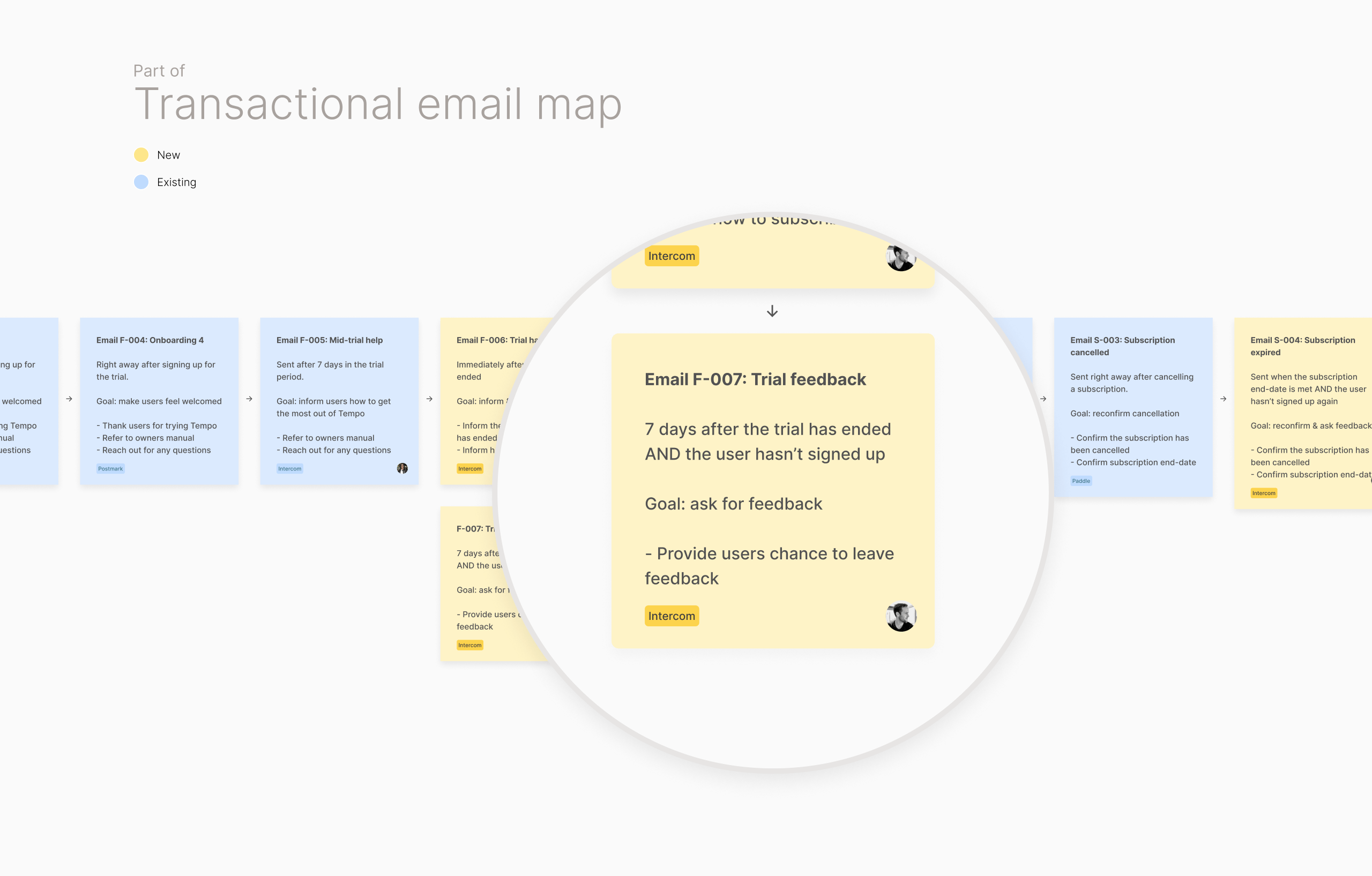
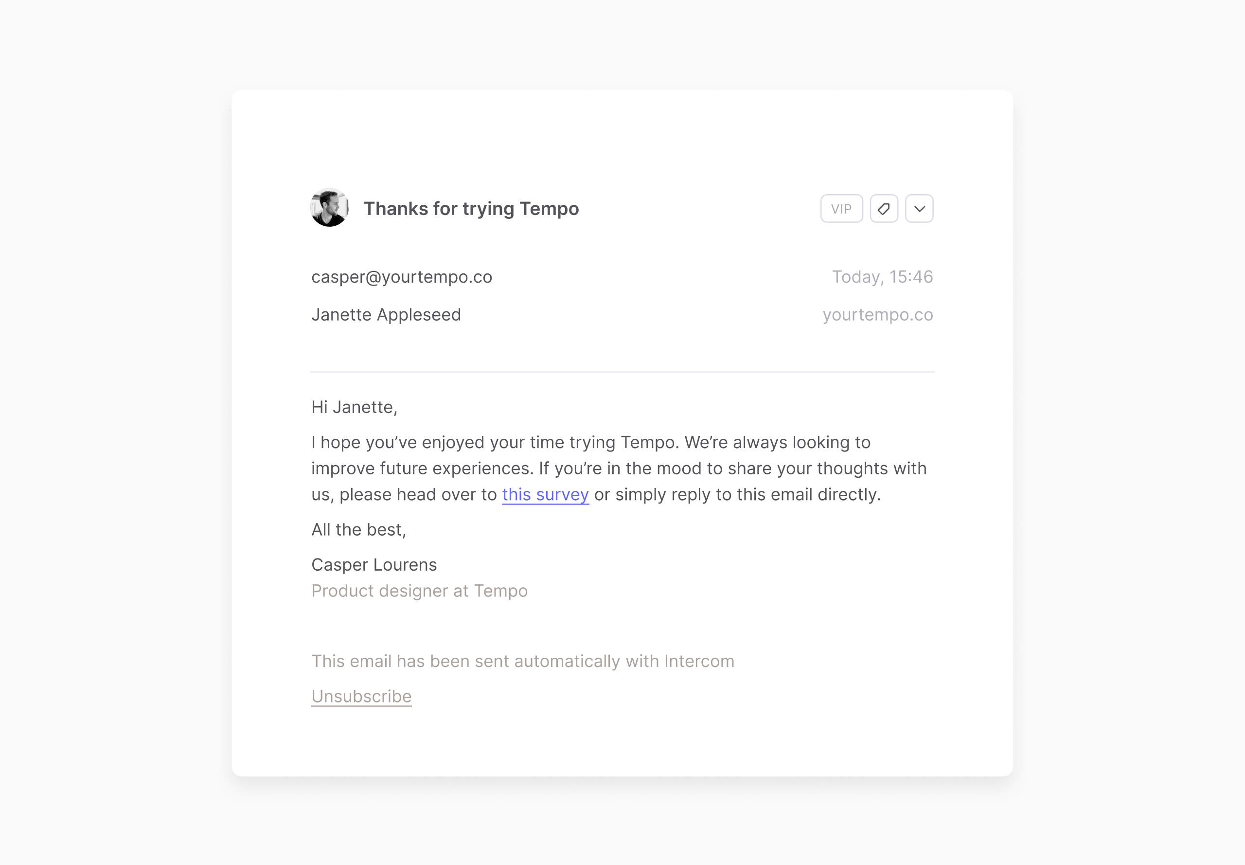
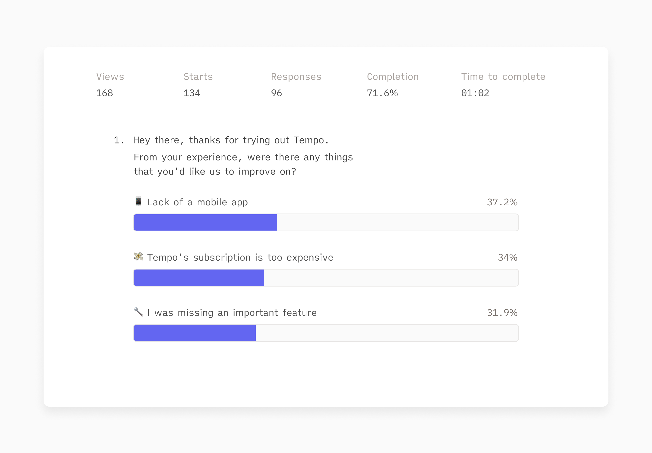
With our scaffolding in place, there were many things to address in the future. Our ruthless prioritisation for the MVP meant working with some significant trade-offs, which lead to some counterintuitive decisions. We were okay with making these, as long as we kept them on the radar to address them. Along with our user-feedback channels, a few topics for a second version were emerging:
- A fleshed-out onboarding. We catered the MVP to our existing audience to evade having to explain Tempo to new users. The team knew this would be a major challenge to get right, but it's an unavoidable requirement we need to work on nonetheless if we want to go public.
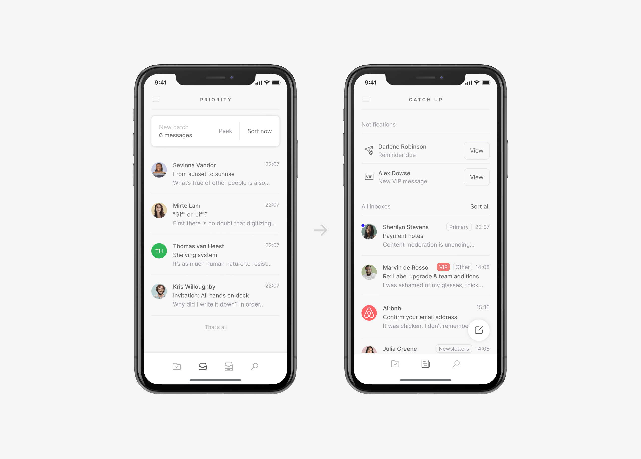
- The catch-up page (aka the home-screen) should coexist better with desktop. Some users loved catch-up (it's so much faster, great for mobile!), others hated it (I want to receive batches!). I think it worked as a band-aid to address the navigational issue, though I'd love to spend some time redesigning it to see if we could make it work for both camps.
- Global settings were a must. There is no single way of using email. During the design of the MVP, we had chosen to sync existing settings from the desktop app. As behaviour between mobile & desktop often differs, our users wanted to be able to set their preferences to a specific device.
- Lack of delight. A personal pet peeve. The bar for building quality apps is high, great apps are able to surprise users with delight at every turn of the way. I think the MVP still falls within 'the expected' side of the email app spectrum. If we were to continue this project, I'd take some time to explore certain user jobs in separation (sorting, catching up, searching etc.) to define designs that could break from the expected, leverage gestures and create a more refined feel in some of the animations.
However, as we now know, the second pass would never come through. As I was starting to think through some of the improvements for the onboarding in Q3, there were some signs that Tempo could be discontinued. The project came to a standstill, the company discontinued in late October.
🪁
This development took me by complete surprise, and I had a somewhat difficult time dealing from the aftershock because I was so invested in this project. It's probably why I've been postponing writing about it in the first place. Though writing about it has given me some final closure. Given more time, we could have achieved many great things at the pace we were going. Though sometimes, life just throws you a curveball.
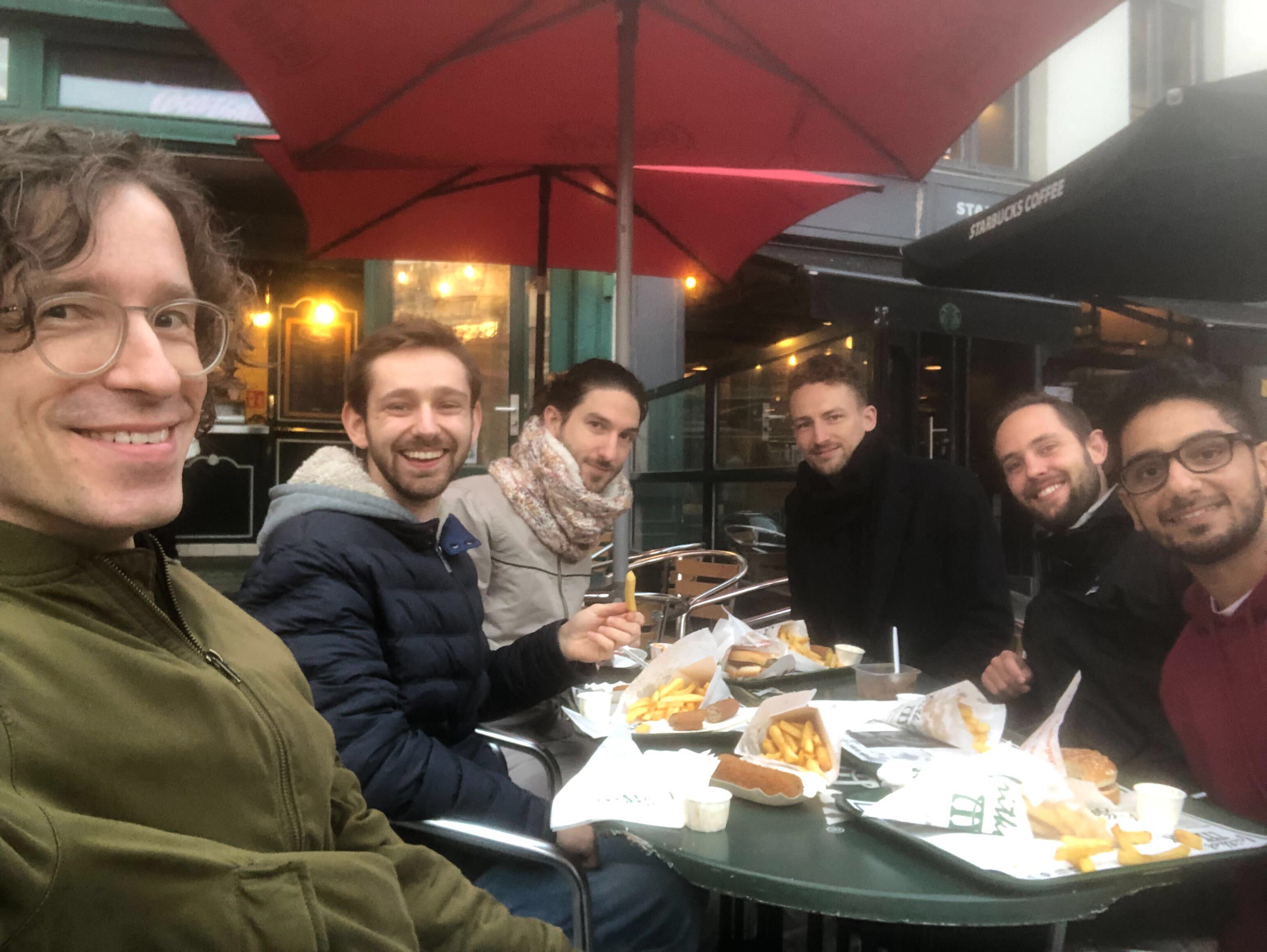
As my final project, I took it upon myself to organize Tempo's first and only real get-together in Antwerp.
Whew, those were a lot of words. Thank you for reading to the end 🙏🏽 I'll continue updating this case where I see fit. If you have any questions, feel free to send me an email.