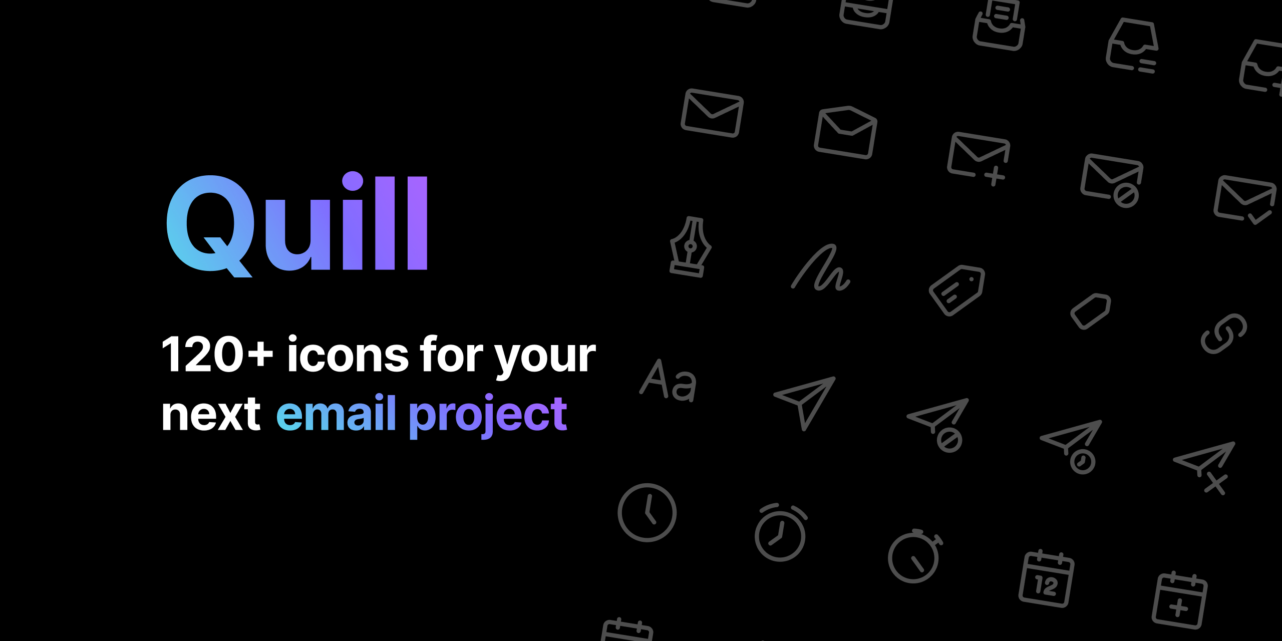
Quill icons
How my first iconset came to be
💡
This project is about icon design, which is something I don't do often. I decided to highlight this project because it was self-initiated and just fun to work on.
The problems
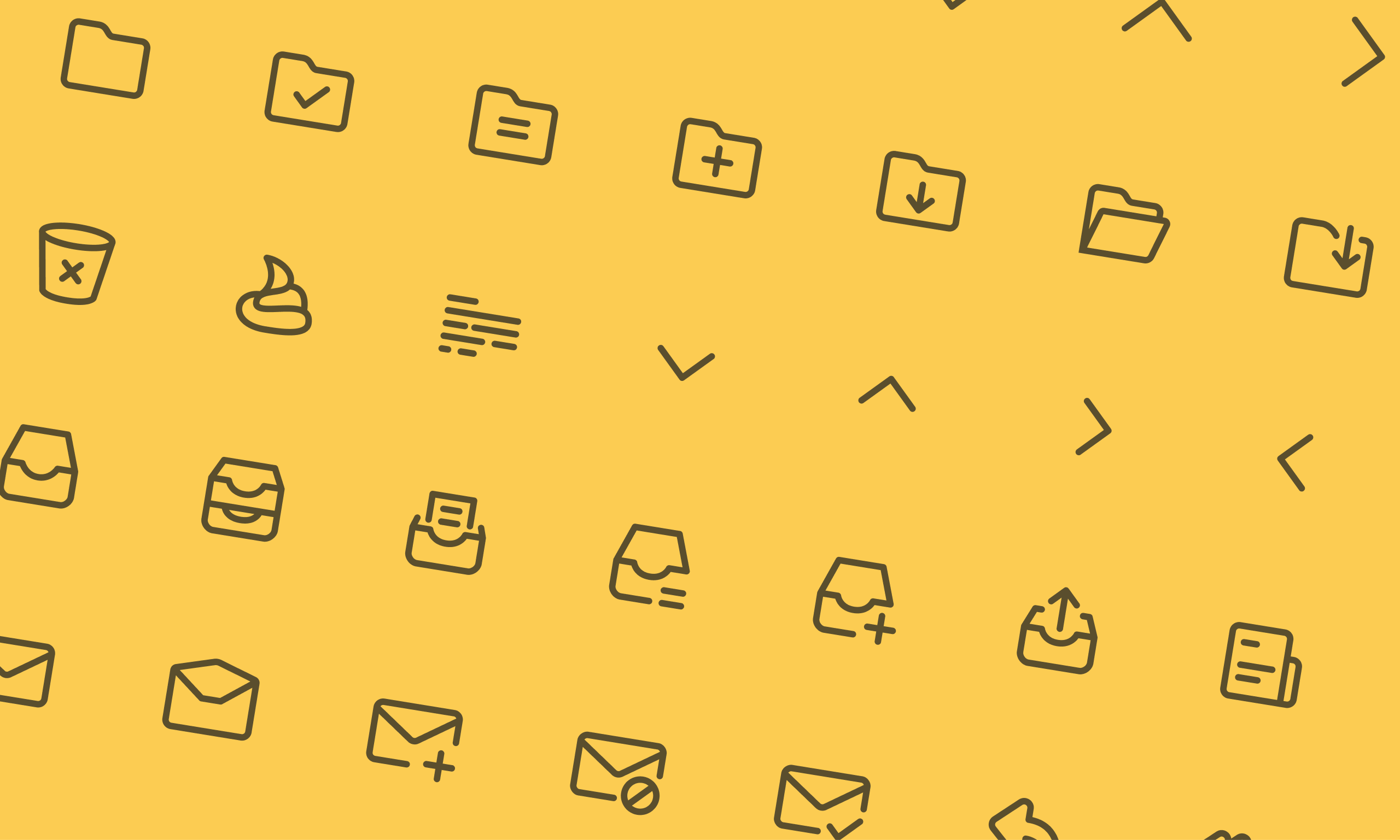
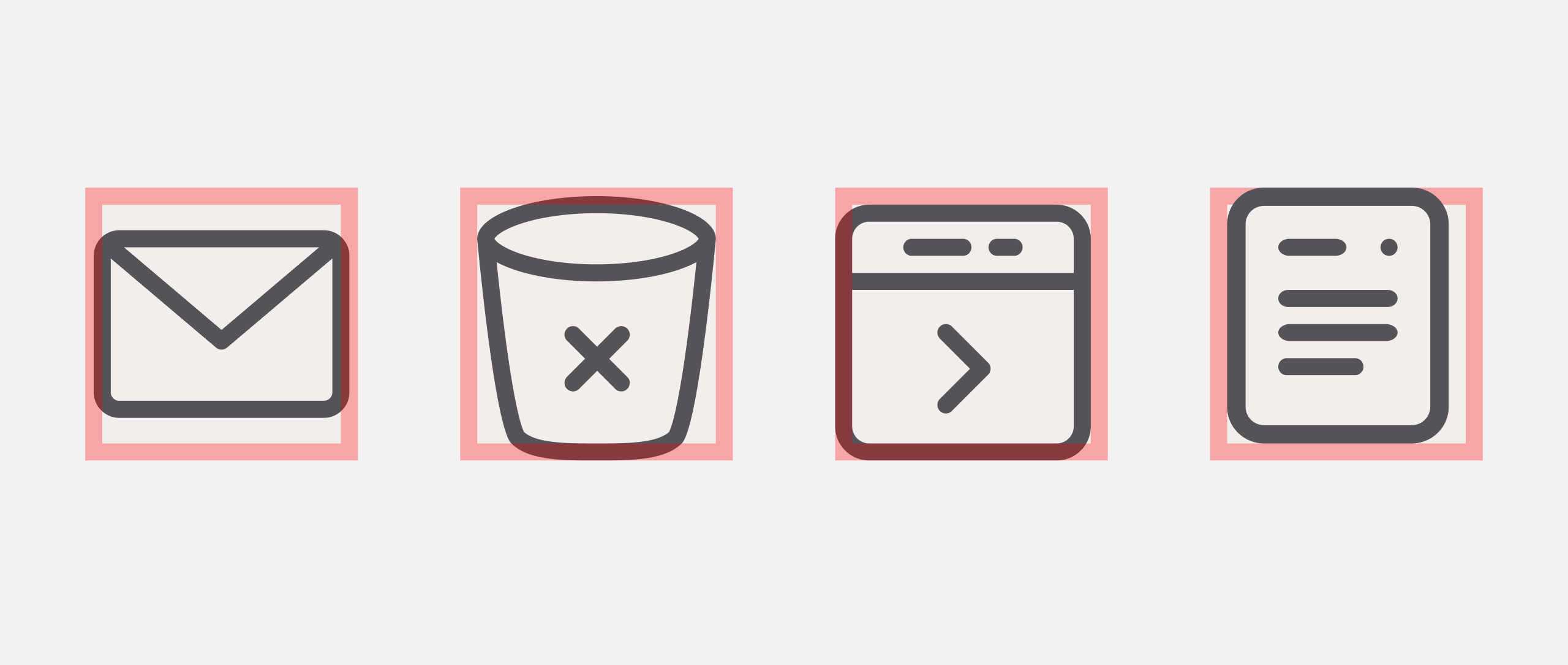
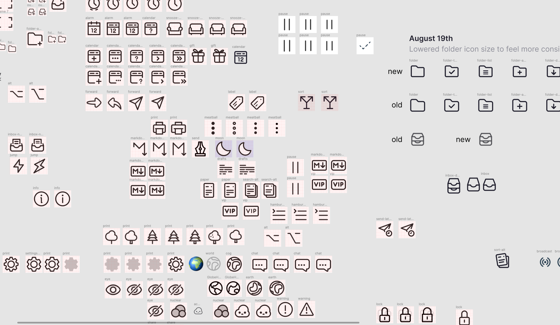
When inheriting the design system at Tempo in early 2021, the icons were a bit of a mixed bag. I loved their general appearance, but they were often hard to work with when using them in any UI or exporting them for developers.
It's hard to pinpoint a single cause, as each icon usually had a specific set of problems plaguing them. To name a few: lack of coherency between styles, some of the icons felt off-balance or used different bounding boxes; some icons would be flattened, others still retained their original layers; some were jagged, some were off-pixel, the list goes on.
You might be thinking, 'this is a very designer-y problem Casper, suck it up', and to an extent, you might be right. This is mostly my designer-eye twitching, and 'functionally speaking' the icons were doing their thing. Still, I believe that when chasing success for the long term, well-designed products should be able to rely on A-grade fundamentals. Would you build a cathedral on quicksand?
The challenges
I've created some icons before but never made an entire set. Luckily, it was my personal learning goal to get acquainted with this.
The goal
Leave the Tempo's icon set in a better place than when I first inherited it. Practically speaking: create a more robust foundation so that we can confidentially use and expand it in the long term.
Approach
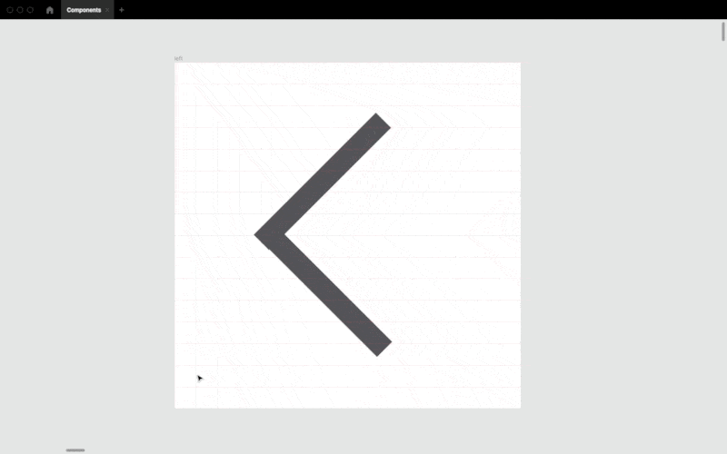
Building an entire icon set would be a huge project, and because the existing icons were not critical to address, I decided it would be unproductive to create a formal project for it. Instead, I reserved 30 minutes at the end of the day to make 3-4 icons from scratch. By doing it off the grid, I was able to spend more time experimenting without the pressure of a deadline. Side note: Helena Zhang's iconography series was hugely helpful for getting started with icon design, it's a great guide to keep on tabs if you ever want to get started with your own icon set.
Without further adue, here were my overall guidelines for the icons:
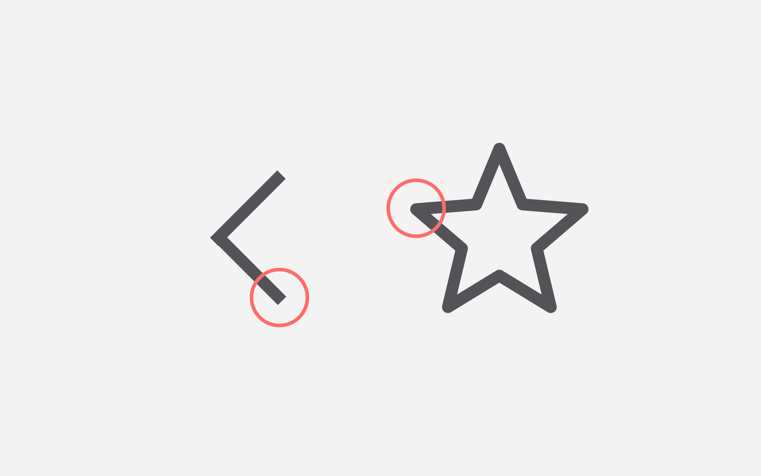
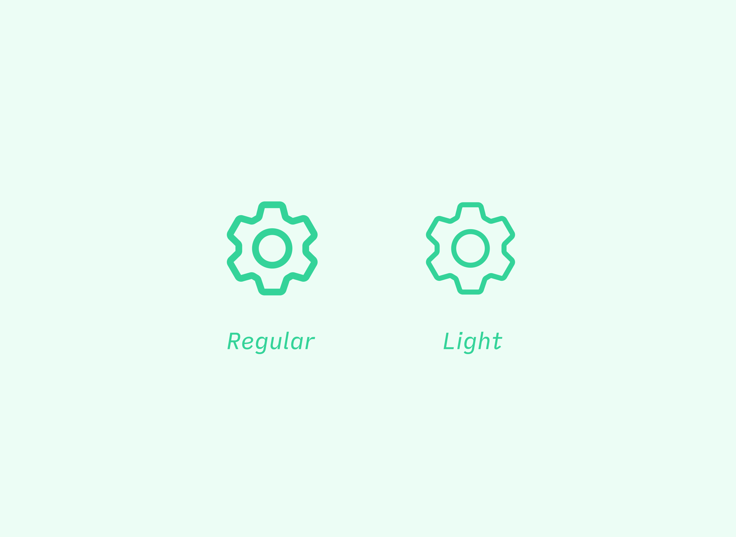
- Designed on a 32px grid
- 2px bounding box
- 2px border thickness
- Rounded caps for strokes
- 2px default corner-radius, 3px for inboxes
- Avoid path fills. If there's really no alternative, keep the surface area small.
- Focus on: simplicity, descriptiveness and the occasional quirk
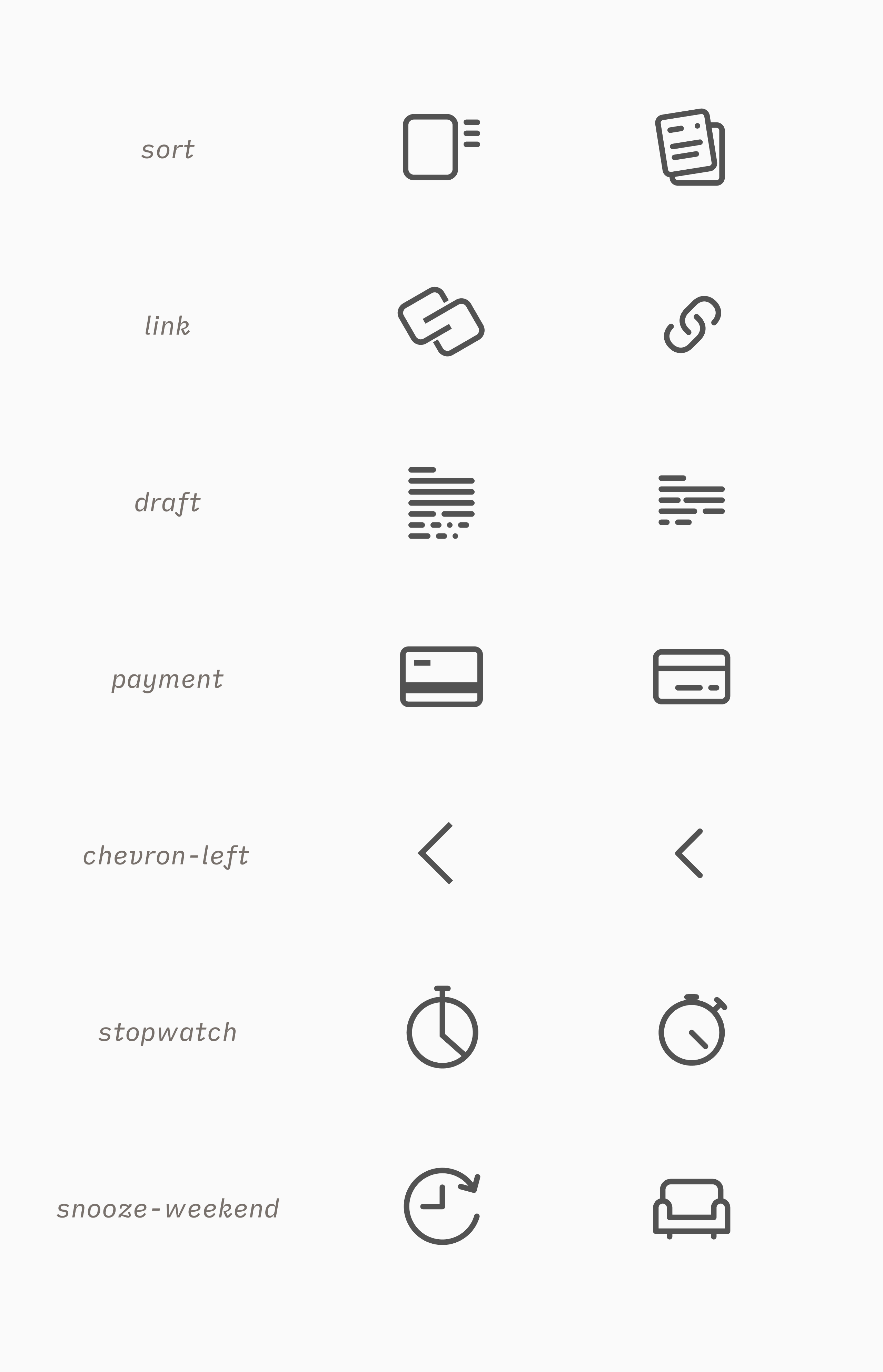
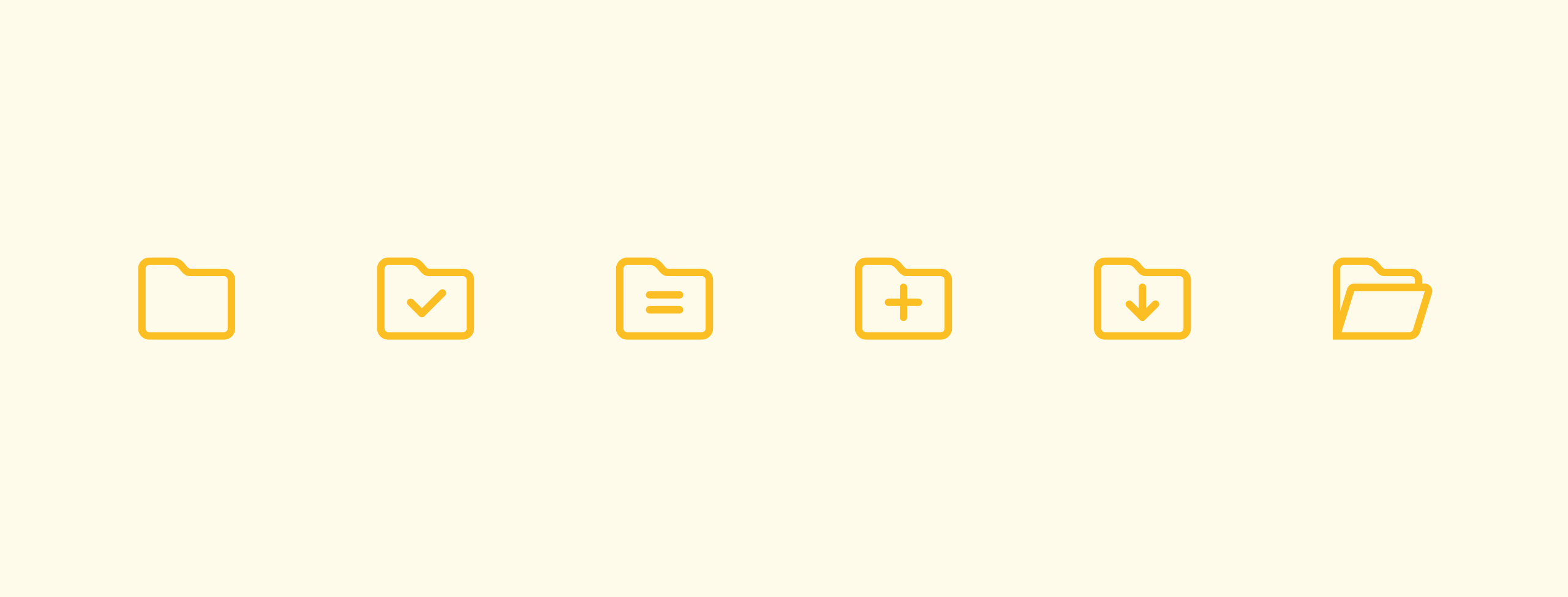
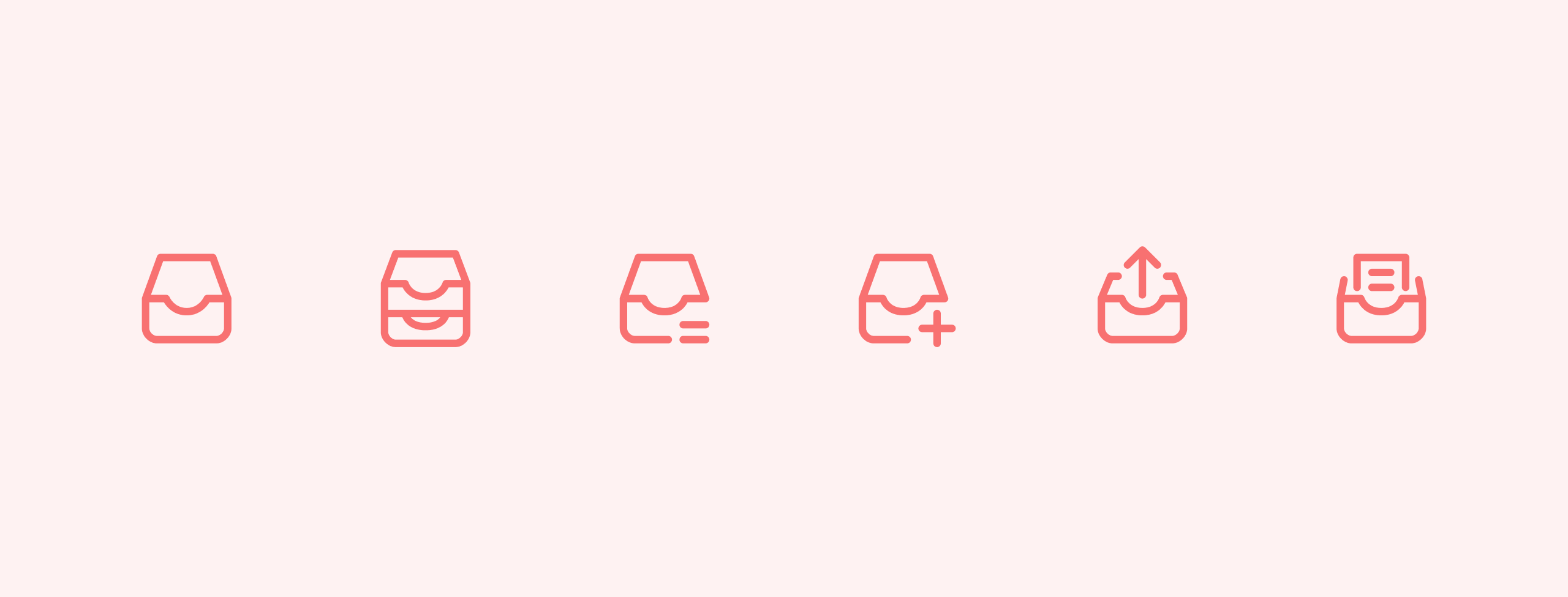
Design
Bringing the team along
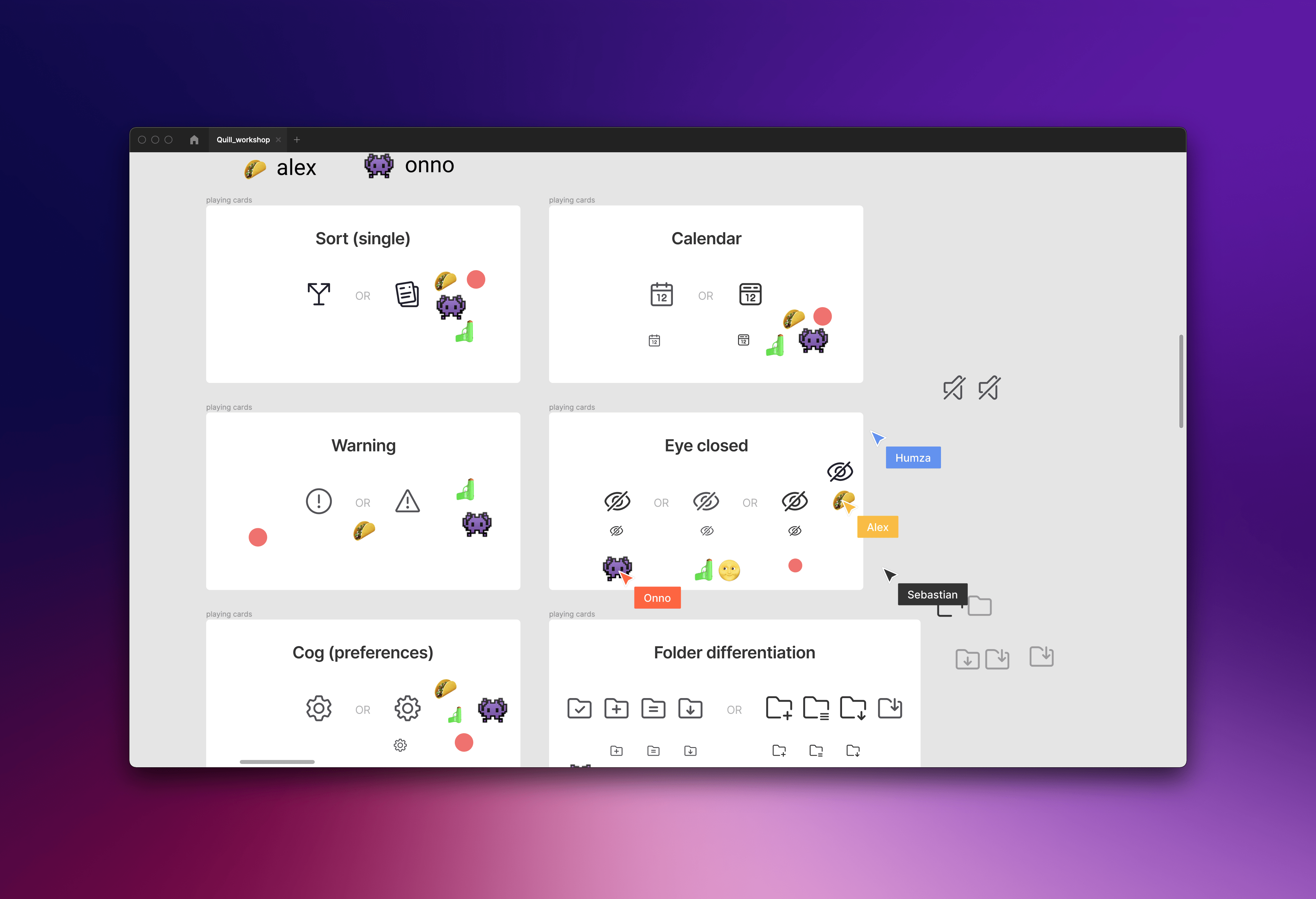
It's hard to get buy-in if you announce you want to revamp the icon set but have nothing to show for it. But when I announced what I was doing, I would already 2/3'ds of the set ready to show. This created a lot of momentum within the team to push it through. Because I was working autonomously until that point, I also wanted to receive some feedback. To gather input, I hosted a small workshop in Figma, where participants voted for their favourite icons and could give feedback on my stylistic choices.
Going open source
Thus far, I had been designing the icon set with the intention to implement them in Tempo's products: the Mac app and iOS MVP. Just after I finished the set, I got the news Tempo would be discontinued, and so these icons would not make it to the product.
However, with all the work done, it would be a shame to shelf it. So the team and I decided to release it as a free icon-set called Quill on the Figma Community. One of the devs was kind enough to create an NPM package for it as well.
Reflection
And that's the story of how my first ever icon set also became my first open-source project! Here are some of my personal take-aways:
- Show; don't tell. If you struggle with getting buy-in, try doing some work upfront so you can show your work instead of debating it. Being able to translate ideas into form is one of the great joys of being a designer anyways!
- Chopping up big projects into digestible increments keeps it fun to work on.
- Icon design is hard but really meditative work. The tight constraints actually allow for a lot of creative experimentation. Have I been missing out?
And finally, my personal favourite icon
I've learned a lot from doing the icon set. Every icon has its own visual and conceptual challenges. In some cases, they even contain short stories, as with the earth icon.
Take a look at the icon, apart from the simplifications, let's assume the continent shown here is Africa. Notice anything off about it?
That's right, it's is mirrored!
Now I thought the designer had made a geographical error here. When asking him about this, he smiled and explained it was actually intended. He explained to me how he was reading about Decolonial Mapmaking at the time he made the first icon. The icon itself succeeds in conveying the earth as we know it without relying on the predominantly western influences of mapmaking, while it's also pleasing to look at. I think that's an awesome design detail.